1. Introduction
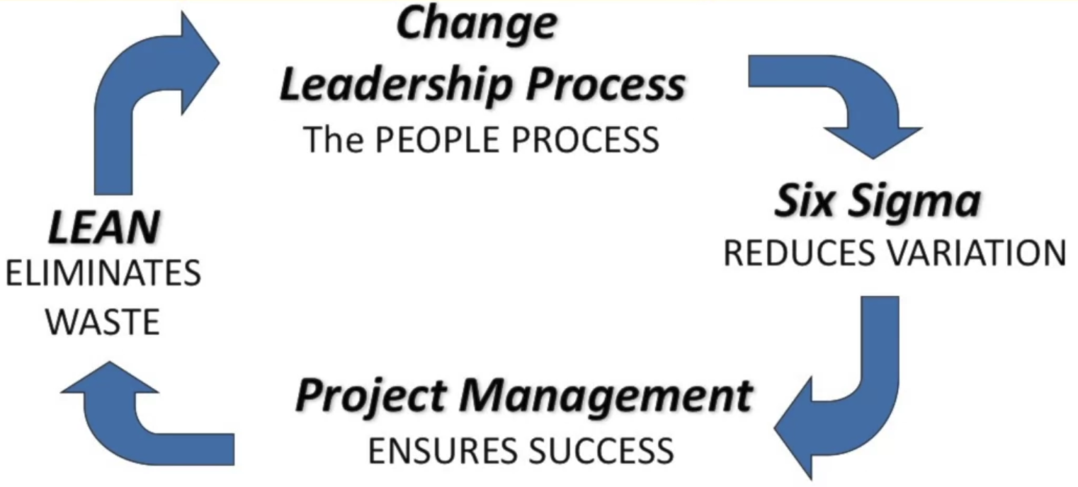
The goal of Lean Six Sigma is to design or improve products and processes to do what they are supposed to do with very high reliability.
Lean Six Sigma is uniquely driven by a close understanding of customer needs, disciplined use of facts, data, and statistical analysis, and diligent attention to managing, improving, and reinventing business processes. — The Six Sigma Way
1.1 Lean vs. Six Sigma
Six Sigma
Object: a quality management philosophy and a methodology that focuses on improving the quality and reliability of process by reducing variability (reduce complexity) — the velocity, or speed of a process from beginning to end
- it’s a project methodology for improvement
Lean
Object: maximize customer value while minimizing waste (increase quality) associated with the flow of material and information
Lean consists of five key principles:
- Identify customers & specify value
- Map the value stream
- Improve flow
- Respond to customer pull, or demand
- Pursue perfection
1.2 The Cost of Poor Quality
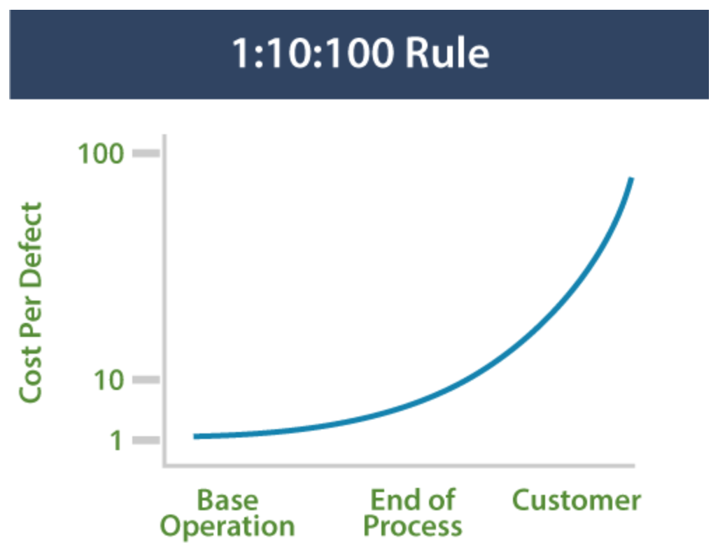
1:10:100 Rule: the cost of poor quality increases exponentially as a product or service moves along the value stream from creation to consumption.
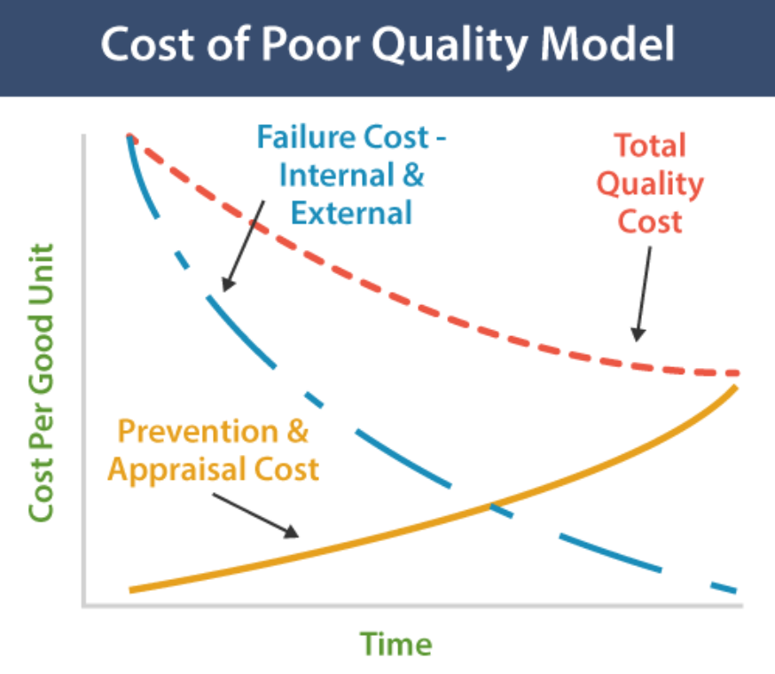
Cost of Poor Quality can be broken down into four categories:
- Prevention Cost: The cost of investing in doing it right the first time. Training, error-proofing, pre-production pilots, design for capability (DFSS - Design For Six Sigma).
- Appraisal Cost (评价): The cost of testing and inspection to detect defects internally.
- Internal Failure Cost: The cost of detecting and correcting defects internally: Scrap, rework, and “Seconds” sold off-price.
- External Failure Cost: The cost of defects being detected by customers, including warranties, replacements, allowances, product liability, customer dissatisfaction and lost revenue.
1.3 Output: A Function of Inputs
The basic philosophy behind Lean Six Sigma is the idea that removing variability from upstream operations that are inputs to a process will yield defect-free outputs
\[y=f(x)\]- $y$ outputs
- $x$ inputs
- $f$ process
1.4 The 5 Lean Principles
- Identify cusotmers and specify value
- Identify and map the value stream
- A value stream is the complete sequence of activities an organization performs in order to produce and deliver its end product or service.
- A value stream map is graphical representation of the series of activities the organzation follows in producing and delivering its end product or service
- Create flow by eliminating waste and achieving a lot size of one
- Respond to customer pull:
- no upstream step in a process produces a component of a prod or service until a downstream step requests it
- Pursue Perfection
1.5 8 Forms of Waste
DOWNTIME:
- Defects - failure to meet the requirements of internal or external customers.
- Overproduction
- Waiting - time spent in queues between steps in a process.
- Non-utilized Resources
- Transportation
- Inventory
- Motion - time spent in queues between steps in a process.
- Extra-Processing
1.9 DMAIC - The Improvement Process
DMAIC: Define, Measure, Ana lyze, Improve, Control
这五个过程并不是按顺序单向的,而是循环的,因为在实际操作中,我们可能会发现在某个阶段的结果不理想,此时就需要回到前面的阶段重新做一遍
1.10 Thought Process Mapping - Toolset
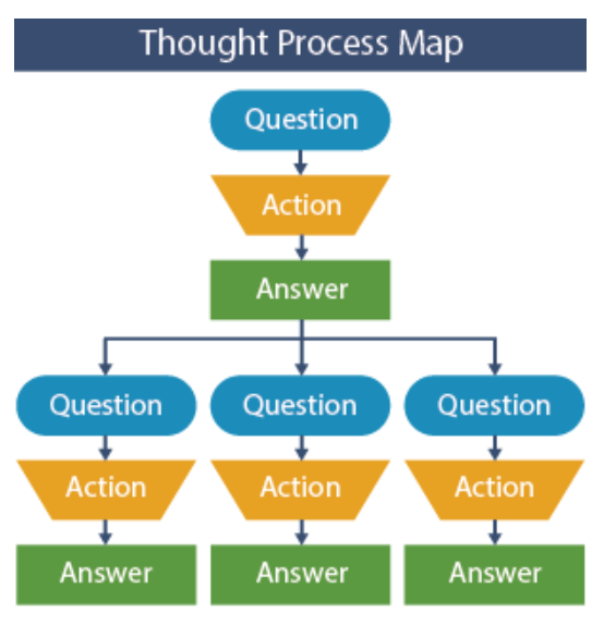
Thought Process Maps are a graphical method to capture and present the complex critical thought processes used to solve a problem or achieve a defined goal.
Constructing a Thought Process Map
A. Problem Statement: The very first element that should be concise, contain a metric that can be used to monitor performance and should not contain a solution. For example, a good problem statement would be:
- The current manufacturing process has an 80% yield and is creating unacceptable amounts of scrap, or
- Only 85% of customers are completely satisfied with Product A and customer attrition is unacceptably high at 7%.
B. Business Case (Bang for the Buck) 衡量价值: We want to make sure that we are working on things that are important to the corporation. One way of assessing this is by placing a dollar value on the problem to make sure it is worth pursuing. For example, in the problem statement above, the business case might be:
- the 20% scrap was costing the manufacturing plant $10,000 per day.
Business case justifications do not need to be itemized to the nearest penny but are used to provide a means of prioritizing which problems to attack first.
C. Fundamentals of a Thought Process Map: Question, Action, Answer: Each question will drive activities to answer the question. That activity might be as simple as asking someone another question or as complex as gathering data and preparing a control chart. Many times the activities will involve the use of various quality tools to quantify relationships. The activities will lead to an answer to the particular question and in general will spawn more questions from the answer.
Application of Thought Process Maps
Thought Process Maps can be used to answer the following questions:
- What are the critical questions that should be answered?
- What actions should be taken to answer the questions?
- What conclusions can be developed as a result of the actions taken?
- Why should one course of action be selected vs. another?
- What are the team’s operating assumptions?
Thought process maps should be used throughout the entire project, and should be maintained as living documents. As new information becomes available, it should be added to the thought process map.
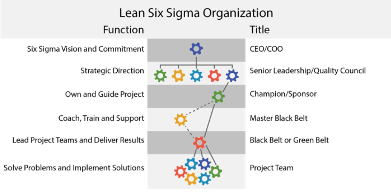
1.12 Working Relationships
2. Define I - Starting a Project and Leading Teams
2.1 Introduction to the Define Phase
The Define Phase of a DMAIC project sets the course of action by capturing and translating the voice of the customer, and then examines the organization’s business processes to identify the areas of greatest opportunity. Every organization has limited resources, so setting priorities correctly to address real customer issues and align actions with intentions is a necessary foundation for success.
The Define Phase is all about asking and answering critical questions.
- What is the problem we are trying to solve? (What are we trying to accomplish?)
- Why are we working on this project? (What is the business case?)
- What is the scope of the project?
- Who are the customers and what do they want?
- What does success look like? (What targets must be achieved to satisfy customers?)
- …
2.2 Project Selection Toolset
The first step in the Define phase is to identify what to work on --- a project. That selection should flow out of the strategic imperatives (战略需要) of the business, and should be based on an evaluation of three characteristics:
- Project Alignment tells us whether the project is consistent with the overall mission and strategy of the business.
- Project Payoff analysis tells us whether the project is worth doing.
- Project Scope tells us whether the project can be done. In determining project scope, there is danger at both extremes. If the scope is too narrow, the project will be easier to implement, but the benefits to the customer may be negligible. If the scope is too broad, like “solving world hunger,” the potential benefits may not be realized because the project is too massive to push across the goal line. The first step toward identifying a proper project is to understand how to diagram a process.
A project should be: 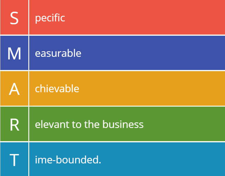
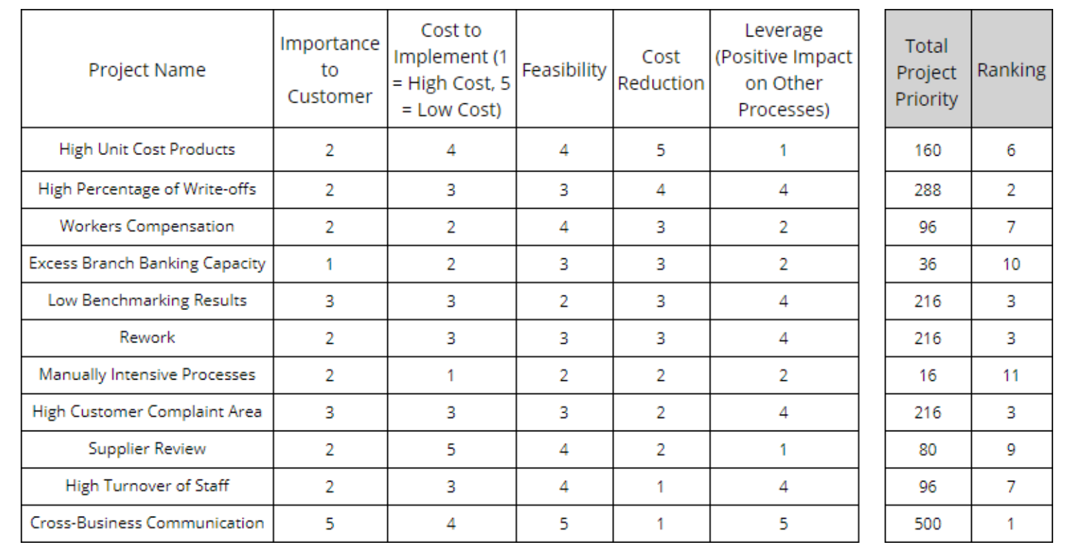
Example: Setting Priorities
Building a sound business case incorporating all of the tangible and intangible benefits and costs of a project. Pareto charts are useful tools for setting priorities, but they only rank according to one dimension. A more complete analysis involves evaluating multiple dimensions of performance in a matrix format. The following matrix is an example of a project prioritization calculator whereby each of five factors is given a rating, and the product of those factors gives a relative score that can be used to set priorities.
How: Building The Business Case
Building the business case means comparing the benefits of a project to the costs of implementing that project. Projects with the highest ratio of benefits to costs offer “more bang for the buck” - the basis for setting priorities and making choices.
Project benefits and costs can both be evaluated in five general categories:
- Costs that affect the Income Statement (Profitability)
- Sales Revenue that affects the Income Statement (Profitability)
- Capital Required (equipment or inventory) that affects the Balance Sheet
- Cash Flow that affects liquidity of the Balance Sheet
- Non-financial actions with an ethical or social impact.
2.3 Project Charter Toolset
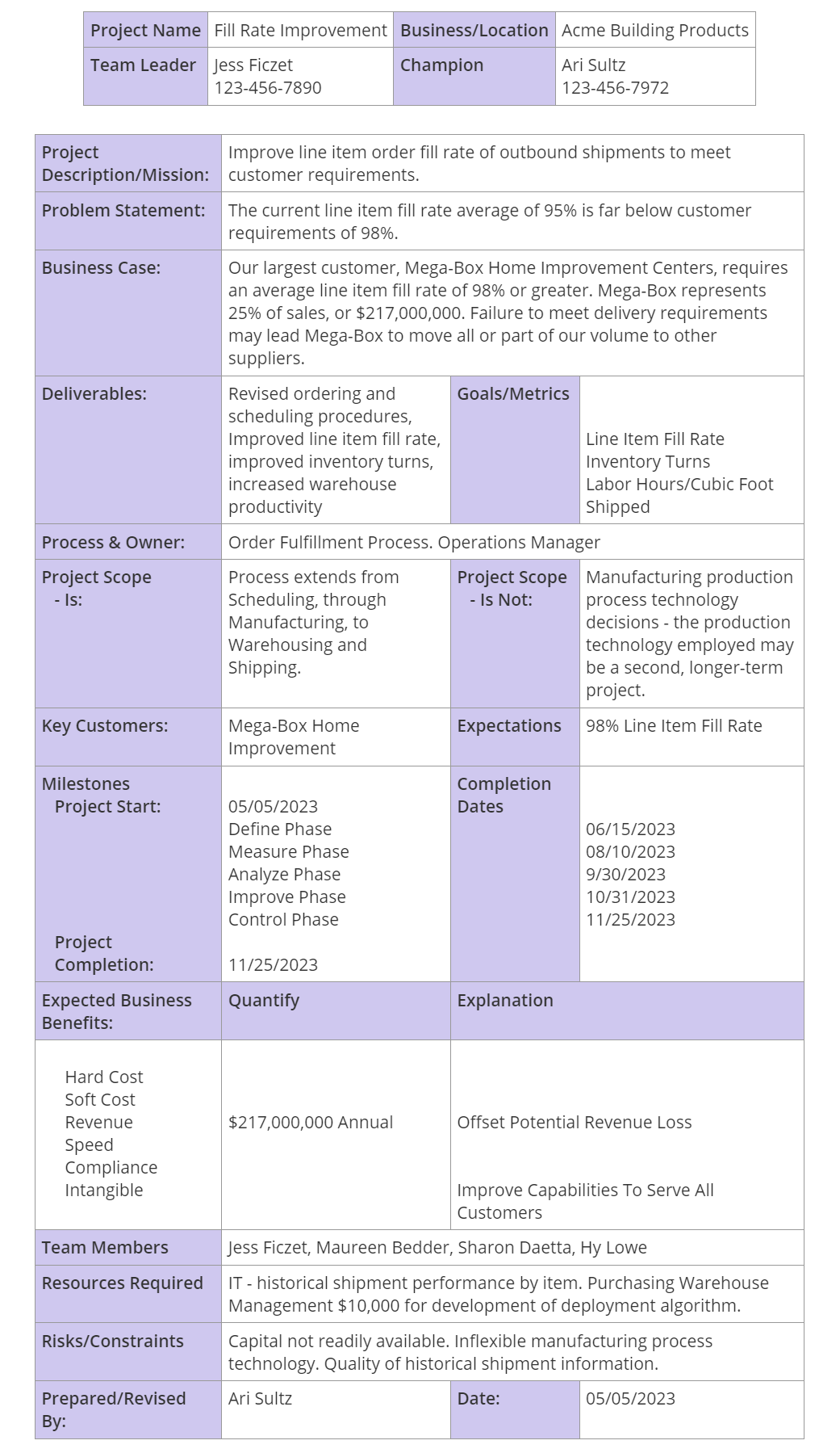
Once the priorities for Lean Six Sigma projects are developed, the next step is to craft a Project Charter (项目章程), which defines the mission and scope of action for a Lean Six Sigma team. The Project Charter is reviewed and approved by the project Champion or Sponsor, and gives the team authorization to dedicate organizational resources to the project.
It answers several basic questions that are fundamental to Lean Six Sigma:
- What is the goal (mission) of the project?
- Why are we pursuing this goal (problem/opportunity statement)?
- How does it relate to the business plan and to the bottom line (the business case)?
- What are all of the outputs (deliverables) of this project?
- Who are the players? -Team Leader, Team Members, Sponsor
- Who are the primary stakeholders?
- When is the team starting?
- When will the project be completed?
- How will we measure success?
Example: a project to improve the order fill rate
How To Develop A Charter
Steps:
- Identify the opportunity for improvement. The outline of an opportunity statement (also called a problem statement) is drafted by the Project Champion and the Team Leader.
- The Champion and Team Leader create a draft charter, filling in as much information as is available. The business case should include an estimate of the economic impact of the project, so it is very clear why the project is worth undertaking. A SIPOC Map is often helpful to define the scope of the project.
- The Team Leader and Champion then identify and invite people to participate as team members. It is advisable to include people with firsthand knowledge of the process.
- Meet as a team to review the charter, identify areas where further information is required, and develop a plan to obtain the required information. For example, there may be no existing performance metric to gauge success, which would require development of a system to capture the necessary data.
- The Team Leader reviews the charter with the Champion for buy-in and commitment of resources.
When To Develop The Charter
At the start of the project.
As new information becomes available, it may be advisable to update the charter and make a mid-course correction. Any of the following events may prompt a change to the charter:
- New competitive threats
- New information that challenges existing operating assumptions
- Product or process development breakthroughs
- Feedback on the feasibility of planned actions
- Business restructuring
2.4 Project Planning & Tracking Toolset
Project tracking tools start with four basic questions:
- What tasks are being performed
- How are the tasks interdependent?
- When will they be completed?
- Who is responsible for each task?
One of the most popular tools to track activity is the Gantt chart, as it provides answers to each of these questions.
Example

The “critical path” (橘黄色), is the sequence of interdependent tasks that have the longest combined lead time. Delays in tasks on the critical path delay the entire project, whereas delays in tasks not on the critical path will not. The value of determining the critical path lies in the power to meaningfully prioritize or deprioritize tasks accordingly
How to Set Up Project Tracking with a Gantt Chart
- What tasks are being performed?
- How are the tasks interdependent, and when will each task be completed?
- Who is responsible for each task?

2.8 Leading Teams
At the most basic level, successful team action requires two components:
- Everyone must know what to do and how to do it (know-how).
- They must care to do it (want-to). This is the emotional component - call it inspiration - a sense of purpose.
The first crucial step to developing effective teamwork is to understand what exactly constitutes a team
- In the book The Wisdom of Teams, Katzenbach and Smith define a team as “A small number of people with complementary skills who are committed to a common purpose, performance goals, and common approach for which they hold themselves mutually accountable (相互负责).”
Team Development Process
Forming: As a group forms and members learn how to deal with one another.
- If you have any input into the process, pick the most capable team members possible.
- Do enough background research to be able to introduce team members and explain their strengths to the group, including specific past successes - this will lower the anxiety level and establish mutual credibility.
- Raise and address questions explicitly - why the team was formed, the mission as you understand it, why members were chosen.
- Share all information regarding the team charter and scope of team authority (budget, resources).
Storming: The Storming phase was named for the swirling change, individual emotion, and group conflict that characterize this step of the process.
- Use the S.M.A.R.T. acronym to guide objective/goal-setting. Team objectives should be Specific, Measurable, Achievable, Realistic, and Time- oriented.
- Establish ground rules and defined roles quickly, including rules for mutual respect and decision-making. You can use a “talking stick” rule to encourage better dialogue (see Dialogue section below). Specify the decision-making process: majority rule, consensus, defer to small group of experts, or team leader with input. A small set of rules can encourage rather than discourage the development of complex adaptive systems (teams). Effective teamwork hinges on: 1) understanding of the “local rules”, 2) a willingness to follow them, and 3) the ability to follow them.
- Schedule meetings frequently enough to work through the natural progression in a short period of time without losing momentum.
- Deal with any bad behavior or poisonous attitudes quickly and directly with a one-on-one conversation. If any individual is poisoning the team, don’t think twice about replacing that person, even if it sets the team back.
Norming (规范化): As teams resolve issues generated in the Storming phase and reach consensus on the team’s “future state” they enter the more productive Norming phase. Team members will reconcile their competing loyalties, agendas, and responsibilities
- Consolidate the gains by encouraging real dialogue (鼓励真正的对话来巩固成果) - an open exchange of ideas.
- Implement guidelines for effective meetings: 1) preparation 2) conducting the meeting 3) follow-up.
Performing: As teams mature they may enter the most productive phase of team development - Performing.
2.11 4 Conversations Toolset
People are driven by conversations. In their book “The Four Conversations”, Jeff and Laurie Ford make the case that “getting more of what you want, and less of what you don’t want - in work and in life - depends upon how you use the four types of conversations”. Here’s a breakdown:
- Initiative Conversations: When you talk about creating a new future state, starting a project, setting a new goal, or changing a strategic direction, you are having an Initiative Conversation.
- Understanding Conversations: When you talk about the meaning of your ideas, or clarify your intentions, or elicit objections, or identify relationships, you are having an Understanding Conversation.
- Performance Conversations: These conversations are about specific requests and commitments: asking for something to be done, followed by a promise to deliver. Performance conversations lay the foundation of accountability.
- Closure Conversations: When you agree that commitments have been met and thank someone for their contribution, you are having a Closure Conversation. These conversations allow people to mark accomplishments and move on to other work with a sense of clarity.
Initiative Conversations - Create a Future
Good Initiative Conversations are about creating a compelling vision of the future - a defined journey toward a desirable future state, with strong argument to make the case for action. An Initiative Conversation should clearly communicate What you want, Why it matters, and When it needs to be done. The goal is to engage the people who will play a role in effecting the desired change.
Focus on the positive vision and the goals, not the perils, or the journey may never start. A clear appreciation of “what we CAN do” should precede any discussion of “what we CAN’T do”. Subsequent conversations are then more appropriate to plan for potential problems and other contingencies.
Understanding Conversations - Include and Engage
The Understanding Conversation is about helping people overcome their doubts and find the positive meaning in your message.
The first exchanges of questions and answers should clarify the strategic issues: What, When, and Why? With the big picture settled, the more tactical considerations come into play. This is where it gets more personal, so tailor the practical discussions about Who - Where - and How so that people can relate your message to their personal world. As always, if you can explicitly address WIFM, or “What’s In It For Me?” you’ll elicit a higher level of engagement.
Performance Conversations - Ask and Promise
Performance conversations are closed-loop exchanges that start with a request, or ask, and close with a commitment, or promise. They lead to specific agreements about What is to be done, When it will be done, Why it matters, Who will do it, Where the result will be delivered, and How the work will be done.
Closure Conversations - Good Endings
Is is the mechanism to look back, acknowledge the facts, take responsibility, apologize if necessary, and move on. Here’s a useful model to structure your closure conversations - the 4 A’s:
- Acknowledge the facts - tell it like it is: the good, the bad, and the ugly. Improvement always starts with a willingness to recognize and accept the truth.
- Appreciate the people who made contributions and sacrifices. Recognizing and thanking the people who contributed to the success of an initiative is free and easy, so why not take a minute and do it!
- Apologize for mistakes, missteps, and misunderstandings so that relationships are mended and strengthened.
- Amend broken agreements. When people fail to live up to an agreement to complete work by a certain date, or deliver a required quality level, or operate to a certain standard, the broken agreement sends two signals to the rest of the organization: 1) that particular agreement was not important, and 2) delivering on commitments in general is not important. Broken agreements can lead to more broken agreements in a cycle that contributes to a culture of disrespect or indifference.
Lastly, the 4 Conversations require practice like any interpersonal skill. In the spirit of continuous improvement, take a moment to reflect, learn, revise, and then try again.
2.13 Leading Change
As a team leader, you will doubtlessly encounter resistance to change among your team members and from the larger organization as you move toward implementing improvement actions.
So how do you overcome these obstacles and champion effective change? At the heart of change management are two critical activities: planning and communication. Those activities should be initiated as early as possible, not left until the Improve phase. People need time to assimilate change, so the more lead time the better.
Note: Involving the people who will be affected by change in the improvement process will increase the likelihood of success. If the people who will be impacted help to define and measure the problem, and then assist in generating solutions, they will be less resistant when it is time to implement those solutions.
Success Factors For Effective Change Management
- Pick the right team. Change is hard work that requires a core group of capable and committed people. In football they say you can’t coach speed. So it is with the heavy lifting of change - you need people with talent and drive. You can’t always pick your team, but you may be able to influence some of the selections.
- Communicate the objective. Whether your team was chartered by a Lean Six Sigma Champion or selected by management, the business case supporting your project charter should be accessible. Share the business case data and reasoning with your team. You must answer the first two questions on your team members’ minds: “WHY are we doing this?” and “WHY am I involved in this project?” Most importantly, your actions speak a lot louder than words when communicating the vision or objective.
- Create a sense of urgency with personal relevance. If the project was chartered to respond to a market opportunity, use the desire to compete and win to build a sense of urgency. If the project was chartered in response to a market threat, the case for urgency should be even clearer - but remember, people have a tendency to think that somehow they won’t be impacted by the threat. The sense of urgency has to be personal. Answer the question: “HOW does this really affect me?” Show the data that represents the threat, and use team benchmarking exercises to improve the external perspective.
2.15 Leader Standard Work Toolset
Leader standard work is used to answer the following questions:
- What actions will support the development of an effective lean management system?
- What actions should be taken to develop the desired positive habits and mental models across the organization?
- What actions should be taken to help people in the organization reach their full potential?
- What actions should be taken to demonstrate leadership commitment, engagement, and respect for the people who do the work?
- What actions will help develop strong critical thinking and problem-solving skills?
- What should be the cadence (timing) of all the designed activities considered above?
Planning the Work and Working the Plan
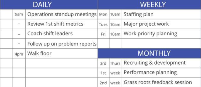
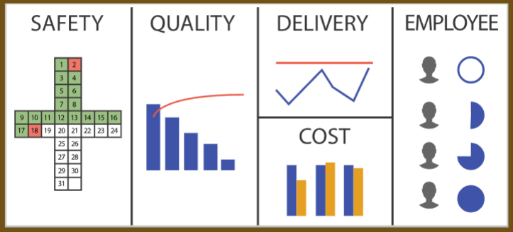
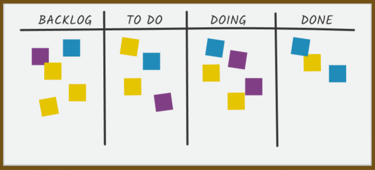
The most important component of a lean management system is the work done by leaders to develop and support that system. Leader standard work is at the heart of a lean management system. The four elements are shown below, but it all starts with what leaders DO
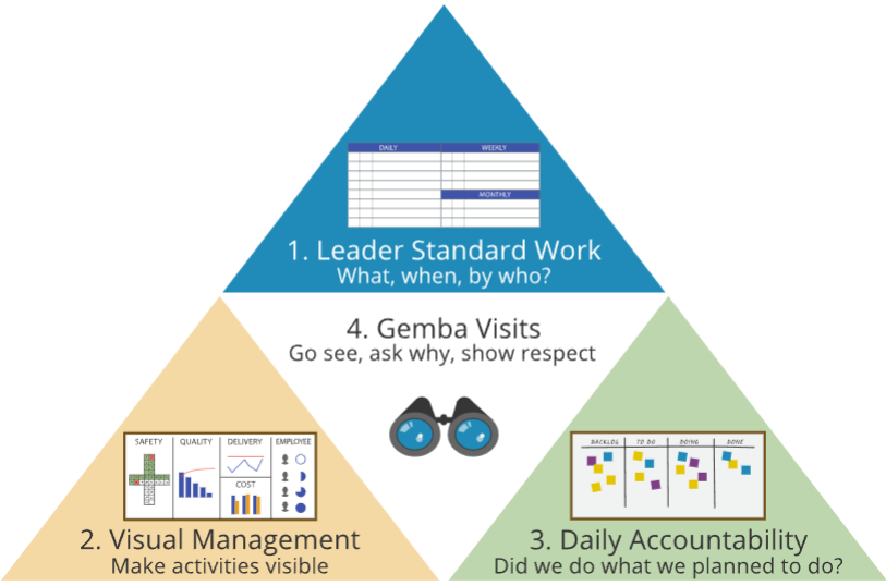
Leader Standard Work
Visual Management
Daily Accountability
How
Standard Work for Developing Standard Work
Start with the end that you want to achieve and work backwards (逆向思维). For example, the basketball coach is using daily actions to build habits. By repetition of actions, he’s purposely changing thinking — working backwards to mental models. And by establishing the right mental models he builds a durable system that yields predictably favorable results.
Coaching to Raise Performance
In the basketball example, coaching is also central to leader standard work, the primary method used by leaders to help others develop. In a lean management system, leading through coaching is built on questions.
- Jumping to conclusions without data doesn’t create problem-solvers; asking “what do we understand about the root cause?” does.
- Telling people what to do does not create initiative; asking them “what countermeasures would be effective?” does.
- Merely setting up key performance indicators and other metrics does not make people accountable; asking “how can we eliminate waste and bring more value to the customer?” gets to the heart of the matter.
Standard Work for Leader Standard Work
The first group of questions is pre-work: to consider your intent, understand the system, and define the good habits that you want to establish.
- What are you trying to accomplish? (Always start with intent.)
- What process steps (inputs) impact that output?
- How can you best measure those key inputs?
- How can you make those measures visual?
- What systems influence those inputs, and what actions can you take to strengthen those systems?
- What mental models are necessary to support the systems you need?
- What routines can turn the behaviors you want to see into habits?
Answering these questions sets the stage to make the specific standard work plan by answering the last question:
- What specific actions should you take on a daily, weekly, and monthly basis to establish the right organizational habits and the mental models that drive them?
2.16 Stakeholder Analysis - RACI Matrix
How often do you hear this?
- I don’t know what I am supposed to do here.
- I find out after it’s too late that I should have informed someone.
- I have the responsibility but not the authority to do the job.
- I don’t know to whom to go for approval.
- …
The RACI Matrix helps to minimize or even eliminate these issues by providing a consistent, simplified approach to defining roles and responsibilities in the planning phase of a project - pre-empting problems before they occur:
- Responsible: (1) Individuals who perform a task are responsible for action and implementation. (2) The degree of responsibility is defined by the Accountable person. (3) Responsibility can be shared by others.
- Accountable: (1) The individual with responsibility to ultimately approve, reject, or veto. (2) There can only be one person that can be held accountable. (3) Many times it is the process owner or the person whose budget will be impacted by the decision.
- Consulted: (1) The individuals to be consulted prior to reaching a final decision or taking a final action. (2) This person may offer advice and/or opinion, but cannot be held responsible, accountable, or liable for the outcome. (3) This person makes no decisions.
- Informed: (1) The individuals who need to be informed of a decision or action. (2) The communication may occur before or after the action is taken. (3) This person has to make a decision as a result of the outcome of the action taken by the team.
3. Define II - Voice of the Customer
An essential step in meaningful process improvement work is understanding the Voice Of The Customer — a five-step process of establishing clear customer requirements to drive improvement actions in the right direction.

The best Lean Six Sigma projects begin not inside the business but outside it, focused on answering the question - how can we make the customer more competitive? What is critical to the customer’s success? — Jack Welch
3.2 Customer Requirements
Understanding Customer Requirements
At the inception of an improvement project, customer requirements are gathered, sorted, analyzed and expressed as Critical To Quality Characteristics, or CTQC’s - the characteristics that really drive customer satisfaction. The first step is to collect information in order to find out what the customer really wants.
- Customer-Specified Products are those products/services where the customer specifies exactly what is required. One example would be a line item fill rate requirement by a large retailer.
- Producer-Specified Products are those products/services which are provided to a wider audience, including a mass consumer market. Determining CTQC’s for such products/processes requires market research to understand what customers really want.

Where to Go For Customer Requirements
Expectations are not static. As product quality improves, customer expectations increase, requiring ever-higher levels of perfection to make customers happy.
Be sure not to ignore two very important “non-customer” groups: those customers that have chosen not to buy your product, and those prospective customers considering buying your product. If you only focus on existing customers, you’ll miss a big part of the picture. After all, if you want to grow your business, you really need to know about the customers that you are not doing business with currently.
The Kano Model
Kano Model was developed to reflect the multiple dimensions of quality and customer satisfaction, which can be divided into three categories:
- Basic - Dissatisfiers - The presence of these features or functions does not produce satisfaction, but their absence creates strong dissatisfaction. (例如汽车必须要每次点火都能启动)
- Performance - Satisfiers - Increasing these features or functions leads to higher satisfaction.
- Excitement - Delighter - The presence of these unexpected features or functions leads to “delight” or customers being “pleasantly surprised”.
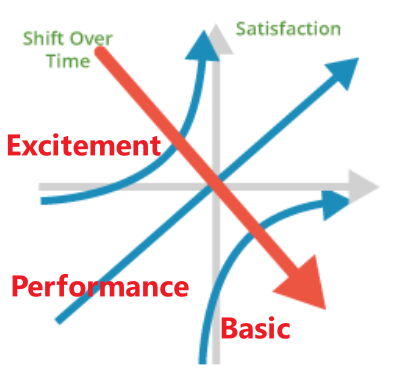
A key point of the Kano Model is that expectations shift over time. What was once an unexpected delight becomes a performance feature, and ultimately an expectation.
3.4 Conducting Surveys
Surveys are a method of drawing broad conclusions about populations by collecting a sample of information from a smaller group of individuals.
- Population always refers to the complete set of every individual within a defined area.
- Samples are a subset of a given population, generally very small in percentage terms. Surveys are the method used to gather information about the individuals in a sample.
Survey Considerations
Stratification is a strategy to focus on a portion of the population to understand more about subgroups and make sure they are represented by collecting independent samples within each stratum, or group. An example of stratification in a political survey is to separately survey registered Independents, Democrats, or Republicans.
To be reliable, the survey sample must be scientifically selected so that each individual has a known measurable probability of being selected. Survey data collection is standardized so that all individuals are asked the same questions.
Sampling Frame
When initiating a survey project, start by producing a written statement of the survey objective. The survey objectives should be as clear and specific as possible.
The sampling frame defines the group of individuals that will be sampled. If the frame excludes certain groups of individuals, sample error will be introduced. For example, a phone survey about the opinions of all Americans would exclude those Americans who do not own phones. That group tends to be economically disadvantaged, so the resulting survey projection could be biased if corrections are not made. For greatest accuracy, the survey frame should be drawn to provide a fully representative sample.
Survey Questions
- Questions may be designed to seek factual information, or they may focus on attitudes and opinions, or both
- Questions can be constructed as close-ended queries, like multiple-choice, or can be open-ended (“What is most important to you when you take an online course?”)
- Questions must be distinct and unambiguous.
- Pre-test the survey to ensure that questions are easily understood and free from subtle bias. You can use focus groups or individual interviews to discuss the questions and identify phrasing problems.
If your customer base is small and you decide to collect information from the entire population, you may want to stratify the survey by customer size or customer profitability. All customers are not created equal. In particular, it would be important to know the requirements of your largest or most profitable customers. It might also be useful to know if prospective customers have requirements different than those you are presently serving.
The Degree of Uncertainty in Sampling
The margin of error is a term commonly used to convey the degree of uncertainty about the results of a sample survey in order to draw conclusions about the population from which it was taken.
Surveys are subject to two types of errors: non-sampling error and sampling error. Margin of error summarizes the sampling error.
- Non-sampling error arises when people don’t understand questions, decline to participate, or do not tell the truth.
- Even if non-sampling error is minimized, sampling error will be present simply because of the laws of probability. Sampling error is a function of the sample size, the variability of the population, and to a lesser extent, the size of the population. For a given population variability, the greater the sample size, the lower the sampling error (subject to diminishing returns).
As a rule of thumb, a random sample size of 100 will produce a margin of error (95% confidence level) no greater than 10% when estimating a population proportion. A sample of 500 will produce a margin of error that is no greater than 4.5%, and a sample size of 1,000 will produce a margin of error no greater than 3%*.
3.10 Affinity Diagram Toolset
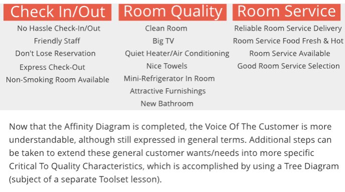
An Affinity Diagram is a tool that gathers large amounts of language data (ideas, opinions, and issues) and organizes them into groupings based on their natural relationships (affinity). The Affinity process is often used to group Voice of the Customer information derived from Market Research, or ideas generated by Brainstorming.

Example: a Voice Of The Customer exercise at a hotel chain. Information about customer wants/needs regarding service and room quality was gathered from several sources:
When to Use an Affinity Diagram
Affinity Diagrams are used in the Define phase of the DMAIC process as the first step toward turning information about general customer “wants” into specific CTQC requirements. The organized information that is developed by an Affinity Diagram is often used as the starting point for a CTQC Tree Diagram (following section), which extends the analysis to a greater level of detail.
It can be used to answer the following questions:
- How can we make sense out of a large volume of information?
- How do the individual items within a list of items relate to one another?
- What are the general categories or groupings of a list of items (customer wants)?
- Is there a particular category of items that represents a large share of the total - a potential priority area?
3.11 CTQC Tree Diagram Toolset
The Tree Diagram is a useful tool for identifying the specific tasks that must be completed in order to reach a goal. Starting with a general goal, the Tree Diagram moves from general WHATs to specific HOWs. This is one of the objectives that must be completed at the onset of the improvement cycle - translating “Voice of the Customer” (VOC) information that is often communicated only as general (or even vague) wants and needs into specific Critical to Quality Characteristics, or CTQCs (also called CTQs).
The CTQC Tree Diagram first identifies intermediate categories of “drivers” — more specific expressions of customer wants — then breaks down those drivers into further sub-categories until customer wants can be expressed as meaningful, measurable and actionable characteristics - CTQCs.

Example: improve room service at a luxury hotel
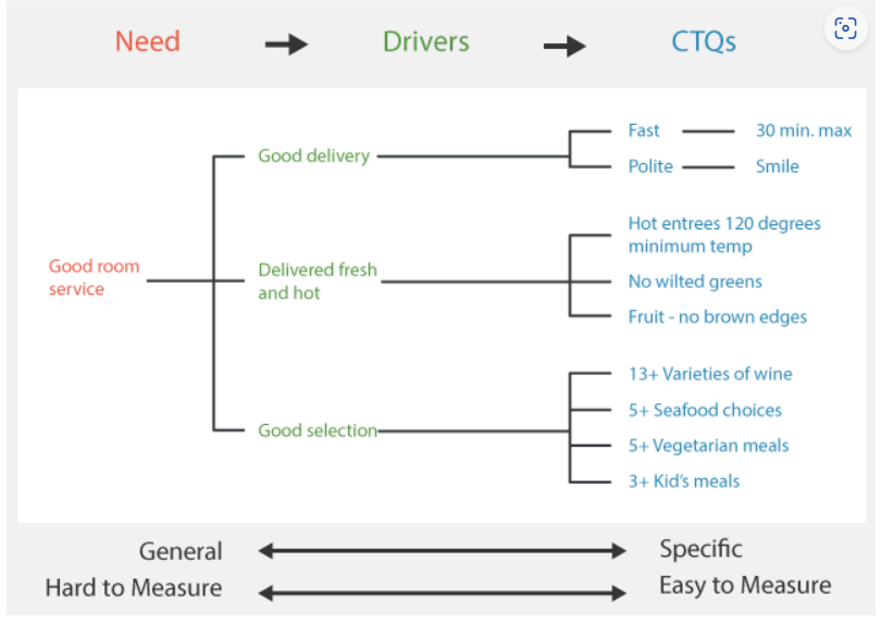
As you can see from the diagram above, the unspecific need of “Good Room Service” can be broken down into three Driver categories, which are in turn broken down into sub-categories of CTQ’s. The idea is to move from general expressions that are hard to measure to specific requirements that are easy to measure.
How: Constructing A CTQC Tree
Start with the What - general goal statement. If you are using the Tree Diagram to identify CTQC’s, the “what” statement may be the raw Voice Of The Customer (VOC) - the high level need or want.
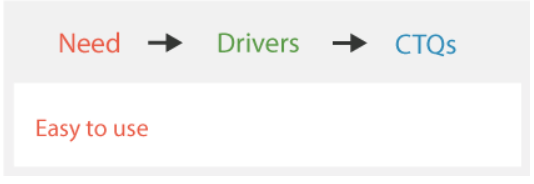
Start moving from What to How by identifying the first level of detail - sub-headings of drivers. This should be based on VOC data, and may also involve elements of brainstorming. Record the drivers, and then move to the next level of detail.
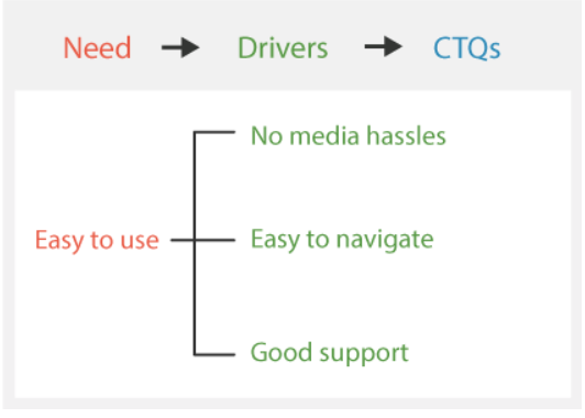
Break each sub-heading (driver) into greater detail by asking the question: “What would this mean?” Remember, you are moving from Whats to specific Hows. Depending on the nature of the information available, this activity may require extensive probing, interviews, or focus groups.
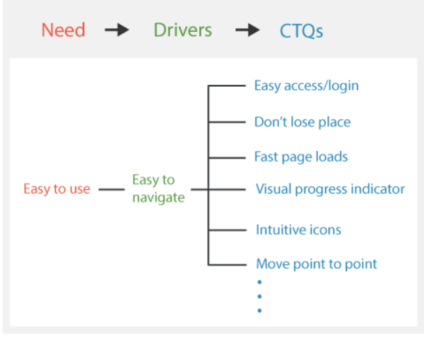
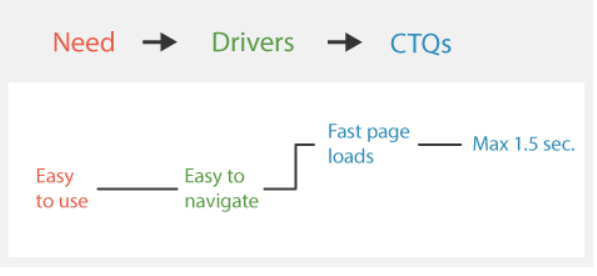
Now we have identified a specific CTQC that can be measured and acted upon. Moving to the next level of HOW detail takes us into the design realm - specific product technologies and component decisions to satisfy the CTQC of “page loads in 1.5 seconds or less”.
When To Develop
CTQC Trees are used in the Define step of virtually every Lean Six Sigma project as the primary mechanism for turning general customer “wants” into specific Critical-To-Quality requirements. They are a natural next step for data generated by an Affinity Diagram to extend to a greater level of detail.
It can be used to answer the following questions:
- What are the specific CTQCs for the process?
- What are the Drivers of customer satisfaction - the categories of CTQCs?
- How do the specific CTQCs relate to one-another?
3.12 Operational Definition Toolset
The next step in defining customer requirements is to consolidate information from various sources and write operational definitions for each critical-to-quality- characteristic (CTQC). Only the significant drivers of satisfaction across the customer base are documented as CTQC’s.
An operational definition is a clear, unambiguous, and observable standard of acceptance. Should also be measurable. Functional characteristics are generally straightforward - they are subject to either a “works or doesn’t work” test, or have an output measurable on a continuous scale. Think of your car. It has multiple performance characteristics such as horsepower, fuel consumption, stereo system output, headlights work/don’t work, etc.
Example: to improve shipping performance
| CTQC’s | Operational Definitions |
|---|---|
| Line Item Fill Rate | The line item fill rate for each receiving location must be 99% or better, on average, on a monthly basis. Line item fill rate is calculated by dividing the number of lines (individual SKU’s) shipped 100% complete, by the total number of lines on the order. Any mis-marked items count against line item fill rate. |
| Carton Bar Codes | 99.9% of all delivered cartons must have a bar code label that can be successfully scanned. |
| Lead Time | Expected lead time for new orders is one week from receipt of order to delivery. Delivery appointments must be pre-scheduled. Lead time will not be penalized if a delivery appointment cannot be arranged. |
| Delivery Appointment Compliance | 98% of all deliveries must be within the assigned time window. Delivery appointments are scheduled in two-hour windows. If the appointment is missed, there may be a significant delay in unloading. |
How to Create Operational Definitions
An Operational Definition has three elements that are used to apply it:
- Criterion - The standard which establishes the objective for the key quality characteristics and against which the test results will be evaluated.
- Test - A specific procedure for measuring a key quality characteristic.
- Decision - A determination as to whether or not the test results indicate that the characteristic meets the criterion.
Suppose one of the key quality characteristics for your children at home is to have a “clean room”.
- Criterion: First set the criterion, or standard, for what is meant by clean. In this example, clean is defined as: bed made, floor vacuumed, dirty clothes in hamper, clean clothes folded/hung and put away, books placed correctly on shelves, and toys in toy box with lid closed.
- Test: After the criterion has been decided, a test needs to be set up to provide the necessary information for determining if the criterion has been met. In this case, the parents and children cleaned a room together until it was agreed that the criterion was met. Next a photograph of the clean room was taken. This photograph was attached to a checklist that included all the criterion. The “test” is that, after cleaning the room, the child checks off each criterion item (e.g. are all books placed correctly on the bookshelf like in the photograph?) and gives the completed list to a parent.
- Decision: Now a decision must be made. When your child presents you with the checklist, you either accept it or not.
When to Develop
Operational definitions provide a foundation for determining whether or not actions need to be taken to improve process performance and should be created prior to the collection of any data.
It can be used to answer the following questions:
- What are the acceptance criteria for this process output (good/bad)?
- How do we know what the customer wants?
- How can we be more consistent in evaluating process performance?
3.13 Voice Of The Customer As Specifications

4. Define III - Mapping the Process
4.2 Process Thinking
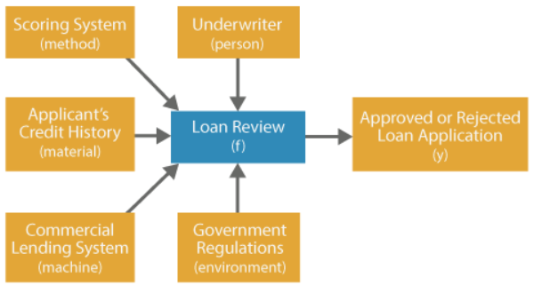
A process is a series of sequenced steps that move products and services through the organization to achieve a desired output. Processes exist at all levels throughout the organization. Consider a commercial lending process: the review of the applicant’s credit history is a specific process within the larger context of the loan review process, which is a part of the entire commercial lending operation (value stream).
At its most basic level, a process consists of a systematic combination of inputs (materials, methods, people, machines, environment) to create an output. The transformation of inputs X into outputs, Y, is often referred to as the function
\[Y=f(X)\]Let’s revisit the process of reviewing a loan applicant’s credit history. The underwriter, the financial history of the applicant, and the credit scoring system (X’s) would be used to make a determination on the loan (Y).
4.3 The Source of Value
Value Stream
Processes that include steps where value is created (as defined by the customer) are called a Value Stream.
We like the term Value Stream because all continuous improvement activity strives to eliminate activities that do not produce value - waste. Value Streams include the tangible flow of material as well as the intangible flow of information and services - stretching from product design and raw material procurement, through manufacturing/service origination, and past delivery to the customer to include after-sales service.
The value stream can be represented as a Supplier-Input-Processing-Output-Customer chain of inter-related activities: 
Gemba (现场)
The first step toward improving a process (or anything) is to develop an understanding of the process - to define what is value-added, and then where and how that value is created. If you want to understand what is really going on, there is no substitute for seeing for yourself. That’s why practitioners of lean methods stress the importance of going to the actual place where the work is performed to learn by observing and asking questions.
4.5 Process Mapping
Any effort to improve a process begins by capturing operational knowledge of the process. Defining the process and its myriad components is the first step, and a visual process map has proven to be the most effective activity. Process maps capture process knowledge in a visual format that facilitates easy communication.
Common Process Map Options: 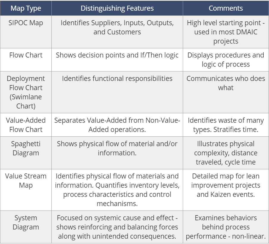
One popular form of process map is the SIPOC Diagram, which is used to create a high level visual representation of a process or value stream - the so-called “30,000 foot view” of Suppliers, Inputs, Core Process, Outputs, and Customers. SIPOC Maps are useful in defining the scope of an improvement project, so they are employed when developing or refining the project charter. Because SIPOC Maps also identify the process inputs, they can also be used as the first cut at identifying potential key process inputs (KPIs).
In order to examine the process of interest in greater detail than allowed by the SIPOC map, a more specific format of process map is often used to drill down and provide more “process resolution”:
- Subsequent process map should reflect the question(s) to be answered
- Value Stream Maps are used to support Lean improvement efforts focused on material and information flows, inventories, and cycle times.
- Flow Charts or Diagrams can also be used to augment SIPOC Maps; they are especially useful in charting procedures and decision processes
- System Diagrams, finally, are a useful tool to map the behavior of a system when there are feedback loops.
None of these charts are mutually exclusive tools - they are best used in combination according to the circumstances. We’ll start with the basic SIPOC Map
4.5.1 SPIOC (Process Map)
Process maps can be developed for any process or sub-process, but they are generally constructed for two reasons:
- Identify waste and prioritize Lean Six Sigma projects:
- Defects or errors that result in scrap, rework, or worse - customer dissatisfaction and warranty claims
- Unproductive movements, unnecessary steps, and double-handling
- Excess inventory due to overproduction, bottlenecks, or discontinuous flow
- Unnecessary time delays
- Wasted energy or other inputs
- Unwanted products
- Understand relationships between inputs (X’s) and outputs (Y’s): At its most basic level, a process consists of a systematic combination of inputs (materials, methods, people, machines, environment) to create an output. To revisit our discussion from Session One, all of the inputs are referred to as Xs, while the process output is Y. The relationship between Y and the X’s is called the “function,” so Y is said to be a function of X.
Example: a process of making coffee As a first step toward mapping a process, the high level SIPOC map is used to identify the areas of greatest waste within the overall value stream.
In coffee making, the process step (step 4) with the lowest capability (lowest Sigma Level) is identified as a priority for improvement efforts. 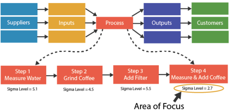
How to Construct
The first step in developing a SIPOC Process Flow Chart is to gather the team, walk the process, observe the process, and take notes:
- When forming your team, include people who are intimately familiar with the process, plus people who are NOT familiar with the process - people who can supply “fresh eyes.”
- Using a white board or flip chart, write down all of the steps in the process - either horizontally or vertically. T
- Next, establish columns or rows to add information on each process category, as shown by the illustration below, which represents the Manufacturing step within the Acme Building Products value stream (Acme manufactures ceramic products):
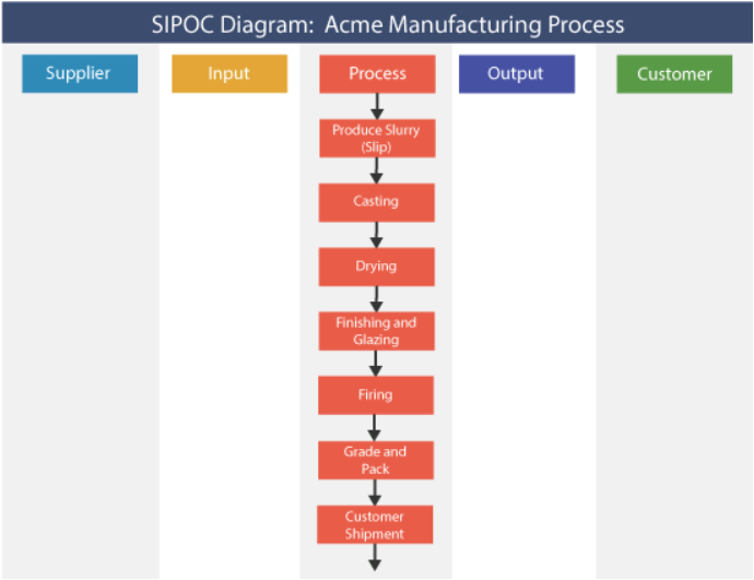
With the basic template established, you can start to add the important details:
- Work backward to identify inputs and the suppliers of those inputs.
- Next, work forward to identify the outputs of each processing step, and the customers of those outputs. You may wish to include information on output requirements (specifications) for reference.
- Don’t forget queues and rework loops. You may wish to note the process owner and any other information that is helpful to the team - remember, this is a working document.
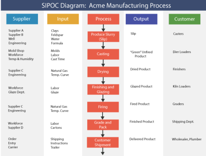
After identifying and prioritizing the inputs or subprocesses that bear further investigation, separate process maps can be constructed at a greater level of detail as the scope of a specific Lean Six Sigma project is defined. At the most detailed level, inputs can be classified as those that are Controllable (like settings on a machine), Noise (uncontrollable factors, like weather or normal person-to-person variability), or Common Sense Factors (procedures that can be expected to be performed to execute a process, like turning on a machine). A closely related activity is the Cause & Effect (Fishbone) diagram, which can be used to help identify the root cause of input variability.
When to Use
It can be used to set business level priorities, and be used again in greater detail to set individual project priorities. It also may be revised at later phases of the process as new information becomes available, or if a finer level of analysis is required.
4.5.2 Flow Charts
Process Flow charts provide a visual representation of the detailed steps in a process, and are particularly useful to represent procedures and decision-making routines.
Used symbols: 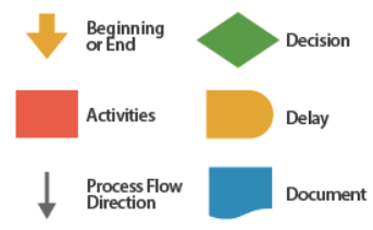
Example: a process of getting out of bed 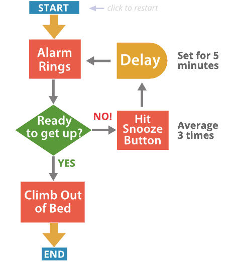
4.5.3 Value-Added Flow Charts
If your project is focused on reducing cycle time or improving productivity, it may be useful to use a Value-Added Flow Chart to highlight waste in the process - any part of the process that does not add value.
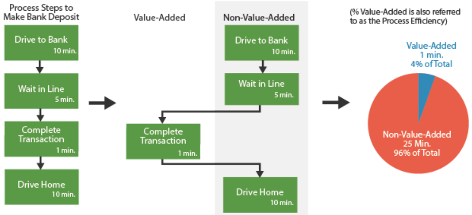
4.5.4 Spaghetti Charts
Beyond understanding the functional steps in a process, it is often useful to identify the physical flow of materials or information (e.g. the flow of a document through a process). If a process follows a bewildering path from operation to operation, you can bet that time delays and inefficiencies are present. The first step to improving the physical flow of a process is to map it using a Spaghetti Diagram.
(1) One is for the physical movement of material relative to the physical location of the process steps, and serves to highlight long travel routes and queue times between process steps. 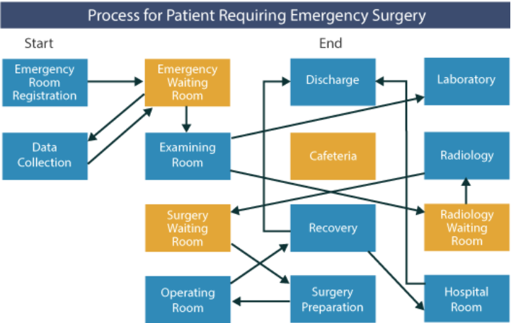
(2) The other examines the movement of information, and is used to highlight the number of times information is handled or manipulated, as well as queue times while waiting for an operation to be performed. 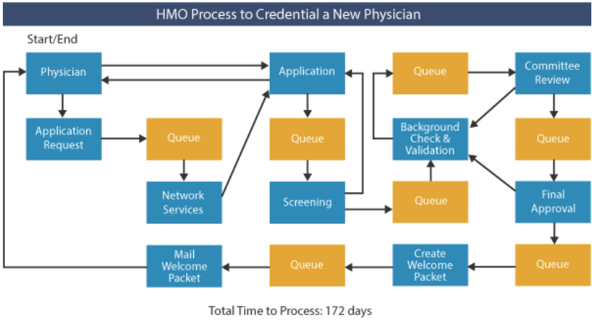
4.5.5 Value Stream Mapping
A value stream is the complete sequence of activities an organization performs in order to produce and deliver its end product or service. It encompasses suppliers, internal processes, customers and end-users.
A value stream map is a graphical representation of the series of activities the organization follows in producing and delivering its end product or service. It shows the flow of information and material and the occurrence of actions using easy-to-understand symbols. 2 main steps:
- Map the current value stream (current state map) - this will help your organization to see the total flow of material and information and to identify sources of waste.
- Map the desired value stream (future state map) - this forms the basis of your lean improvement implementation plan and identifies the specific areas and magnitude of improvement required.
Example: a manufacturer of medical products
AquaMed Intravenous, a manufacturer of medical products, had received complaints from its customers that the 11.5 day lead time between order and delivery was excessive for its saline solution IV bags. Several customers suggested that they would switch suppliers if the situation did not improve. The customer demand is an average of 345 bags per day.
(1) Map the Current State Starting with the Shipping step of the value stream, the team worked backward and identified:
- Each step in the value stream
- The number of employees required to run each step
- The wait or queue time between each step
- The cycle time for each step
- The department responsible for each step
- The name of each step
Finally, the team selected 2 lean metrics to focus their efforts:
- Lead Time - the time (in days) from receiving raw material to shipping product.
- Customer Retention Rate - the percentage of customers who purchase again, measured monthly.
The map of the current state is shown below: 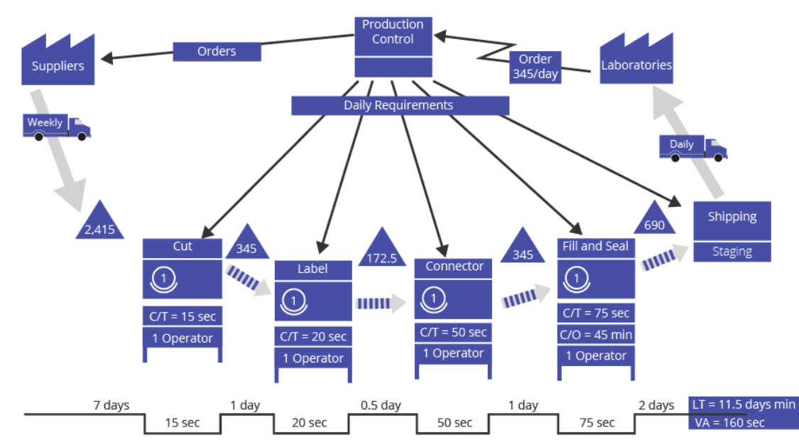
(2) Map the Future State In order to envision the future state the team first calculated the pace of production necessary to meet demand, or takt time (see section 4.10). Known: the facility runs 8 hours (28,800 seconds) per day, 20 mins break time, and demand is 345 saline solution IV bags shipped per day, therefore: takt time = 80 seconds per bag
After performing additional analyses, it was determined that the following changes would be made:
- Combine the Cut, Label and Connector steps into one step
- Initiate a stretch objective for the combined step to improve cycle time from 85 seconds to 75 seconds
- Reduce the change-over time for the fill/seal machine from 45 minutes to 9 minutes
- Reduce incoming inventory to 1.5 days and have daily supply runs from the suppliers
The map of the future state is shown below: 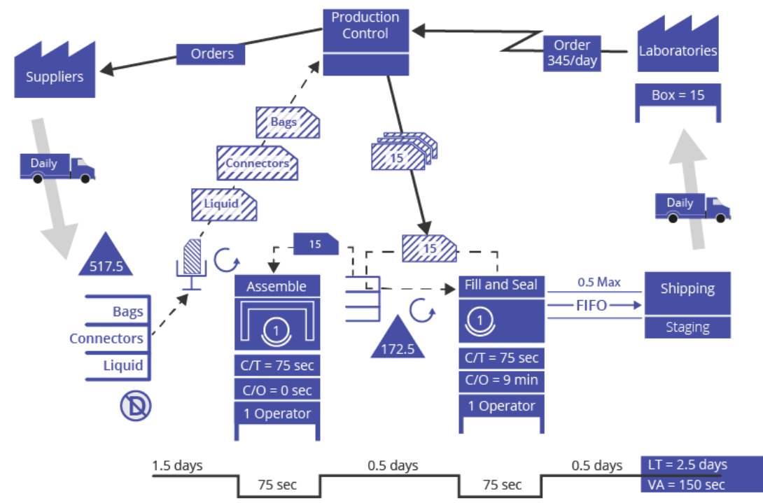
The results of moving the value stream to the future state were:
- The lead time for bags was reduced by 78% from 11.5 days to 2.5 days
- Customer defections were avoided
- Suppliers maintained pricing because the increased shipping frequencies were offset by a more consistent demand
How to Use
(1) Step 1 - Prepare to Map the Current State Effective preparation lays the groundwork for a successful value stream mapping effort. This includes identifying roles within the team, establishing a mapping plan, establishing a data collection plan, and following ground rules. Click on the icon below for detailed step by step instructions:
(2) Step 2 - Map the Current State With preparations in place, you can begin to map the current state. As tempting as it may be to rush through this step and start mapping the future state, be disciplined in documenting the process as-is (按照原样). The map of the current state establishes a baseline from which the future state can be developed and performance targets established. Without the current state, it is impossible to determine how much improvement is needed and how much has been accomplished.
- Draw the external/internal customer at the end of the value stream
- Determine the average daily volume of work results sent to the customer
- Draw the external/internal supplier(s) at the beginning of the value stream
- Starting with the final process, work upstream and draw each process
- Identify any exceptions that are dealt with within the value stream
(3) Step 3 - Identify Lean Metrics In order to assess the level of improvement of the future state over the current state, metrics need to be established and baselined. Very often, the primary metric that is selected is Lead Time which is defined as the total time - including queue - that it takes to create a product from raw material receipt to shipment. In the case of our example, it is the Lead Time of 11.5 days that the hospitals are concerned with and the retention of customers that our company is concerned with. The 2 metrics chosen were Lead Time in days and Customer Retention Rate (%).
(4) Step 4 - Map the Future State A map of the desired future state is developed to identify and communicate the achievable first steps toward improvement, realizing that there will be ongoing efforts to refine the process and realize incremental gains. Starting with a calculation of takt time, the Future State Map outlines efforts to balance production, reduce cycle time, reduce lot sizes and implement continuous flow by pulling rather than pushing work-in-process.
(5) Step 5 - Identify and Plan Kaizen (改善) Events In order to achieve the future state, improvement activities will have to take place - it is not enough to just map the value stream future state. Kaizen (Continuous Improvement) activities are typically what is used to achieve the future state. These quick, focused efforts may be referred to as “Kaizen Events”, or “Kaizen Blitzes”, and may be implemented into the overall project or may stand alone as shorter-cycle projects.
For our example, 2 Kaizen activities were identified:
- Stretch Objective of 75 second cycle time for the combined assembly process. This is needed to bring the value stream closer to continuous flow.
- Error Proofing of the assembly process to ensure proper seating of the connector to the bag. This will greatly reduce scrap and the need for rework, thereby increasing first pass yield. The value stream will be closer to producing what is needed rather than overproducing because of high scrap and rework.
When
A Value Stream Map defining the current state of an organization should be created as the first step of a lean initiative.
It can be used to answer the following questions:
- What is the flow of material and information in our organization?
- Where are the linkages between the information and material flows?
- Where are the sources of waste?
- What should our flow look like?
- Where should our improvement efforts be focused?
4.10 Takt Time
A primary objective of lean operations is to produce exactly what a customer expects or demands over a period of time; no more, no less.
Customer demand is described as a rate (units required per period of time) or a pace (time elapsed between each unit demanded). Takt time refers specifically to the pace of customer demand.
Therefore, if the actual processing time for one unit is greater than the takt time, customer demand is not met. If the actual processing time for one unit is less time than the takt time, customer demand is exceeded and excess inventory is created.
Example: An insurance claims processing center operates on 2 shifts (1 shift = 8 hrs = 480 mins). All operators get one 60 minute break. The processing center averages 336 customer claims processed per day.
- The available processing time per day = 2 shifts * (480 minutes/shift - 60 minutes/shift) = 840 minutes
- The customer demand per day = 336 claims
- The takt time = 840 minutes / 336 claims = 2.5 minutes/claim
A common tool used to compare actual processing time to the takt time is the Takt Time Chart: Steps 2 and 4 exceed the takt time (over-utilized resources / insufficient process capacity); Step 3 falls short (under-utilized resources / excess process capacity). 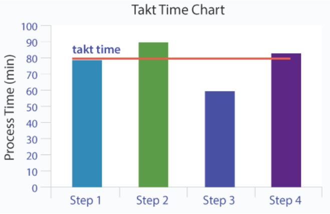
Line balancing is a technique that strives to balance the availability capacity against demand and ensure that no single process step exceeds the takt time.
5. Measure I - Measurements and Basic Statistics
Measurements are the foundation of any Lean Six Sigma project; they drive actions and provide the reliable feedback that is absolutely essential to progress. Without reliable and meaningful measurements the path is uncertain at best. Organizations can communicate their values - what they care about - in a visible way by measuring those activities. The visibility and accountability that flow from measurements prompt activity: what gets measured gets done.
As with the Define Phase, the Measure Phase has its own critical questions that guide the assessment of process performance and process goals:
- How can the Critical to Quality Characteristics (CTQCs) be objectively measured?
- What should be the target for success (in customer terms)?
- Have potentially significant inputs (X’s) been identified for further screening?
- …
5.2 Business Problem Solving with Statistics
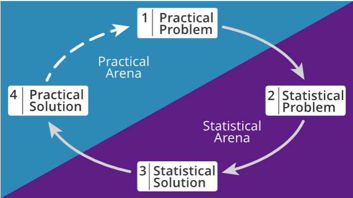
Taking the right measurements is crucial to finding the right solutions to practical problems. Data-driven problem solving is an iterative process with roughly four steps:
5.4 Descriptive and Inferential Statistics
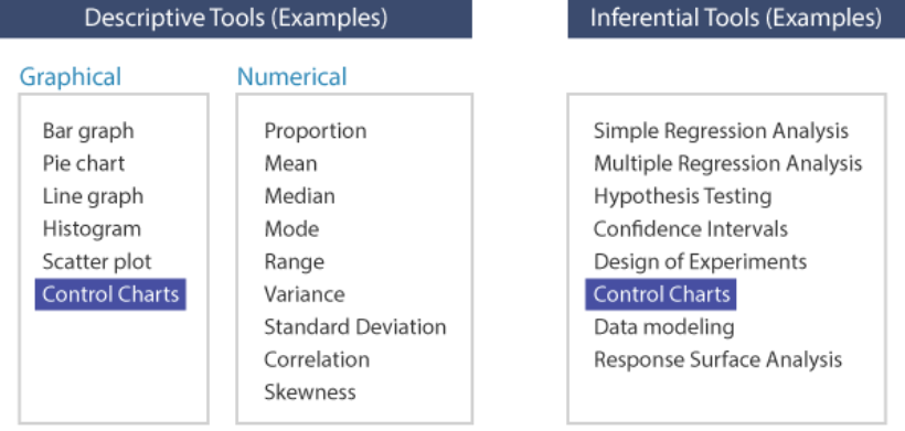
Descriptive statistics aim to describe and summarize the important features of a population or process. Graphs such as pie, bar and line graphs, histograms, boxplots, scatterplots, etc. and numerical summaries like means, variances, etc. are examples of descriptive statistics.
Inferential statistics use sample data to help make comparisons among, or draw inferences about the effects of different solutions or treatments on the overall population. When the entire population cannot be measured, a smaller sample of data is used to infer, or estimate, the characteristics of the wider population. Regression analysis, hypothesis tests and experimental design fall into this category. Some tools can be used to both describe and infer: control charts (highlighted below) observe the process over time to establish stability (describe) and signal the effect of a special cause as soon as the process displays instability (inference).
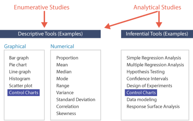
Descriptive statistics are typically used in Enumerative Studies, which aim to answer questions about the current population like “how many?” or “in what proportion?”. The focus is historical rather than predictive
In contrast, Analytical Studies seek to answer questions like “why?” or “what are the causes of?” and aim to generalize the results to future states of the population. Analytical studies are conducted to understand the behavior of a process over time with the intention of identifying relationships between cause and effect which could impact future performance (predictive as well as historical perspective)
5.5 Measurements
What to Measure?
Analysis of existing voice of the customer (VOC) data using tools such as Affinity diagrams, CTQC trees and Pareto charts helps identify the key process characteristics that need to be measured in order to judge progress toward achieving the goal.
Data Hierarchy
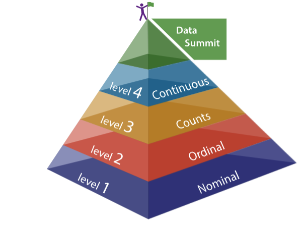
- Level 1 - Discrete Nominal: groups are labels or names, no order. Such as colors, yes/no, pass/fail, profession
- Level 2 - Discrete Ordinal: groups are logical orders. Such as small/medium/large, low/medium/high, first/second/third
- Level 3 - Discrete Counts: number of items or events
- Level 4 - Continuous: measurements are made along a continuum
Discrete and Continuous Measurements
Once the key characteristics are identified, the next question is how to measure them. This depends to a large extent on the nature of the thing being measured. Broadly speaking, there are two types of measurement with very distinct properties – Discrete and Continuous
Discrete measurements are often termed as Attribute data, because they sort or count items based on attributes, such as the presence/absence of defects, quality perceptions, occurrence of an event, etc. Continuous measurements on the other hand, are often termed as Variable data, since they can take on infinite values within any two fixed points.
A little bit of thought and innovation can help make good data decisions. For instance, many factors that appear to be discrete characteristics can be measured on a continuous scale. Color used to be judged using master color chips, creating endless debates about classification. With the advent of relatively cheap and portable digital equipment, color values are now read on a continuous scale, eliminating opinions from the equation.
In summary, we highly recommend taking the trouble (and sometimes extra cost) to collect continuous, or variable, data when possible. To reach optimal performance, an organization must be able to react quickly to process shifts, and the higher the resolution of the data, the faster this is achieved.
5.7 Measurement Subjects: Select Best
Selection of the best measurement may be a function of whether you are measuring Results (outputs of the process), or Indicators and Predictors (inputs and process transformations). Example: for a manufacturer of automobile transmissions, field failures are the results measurement and the dimensions of the internal gears and parts would be Indicator or Predictor measurements.
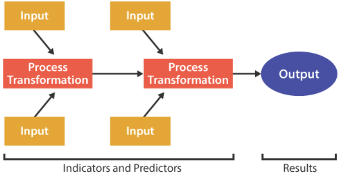
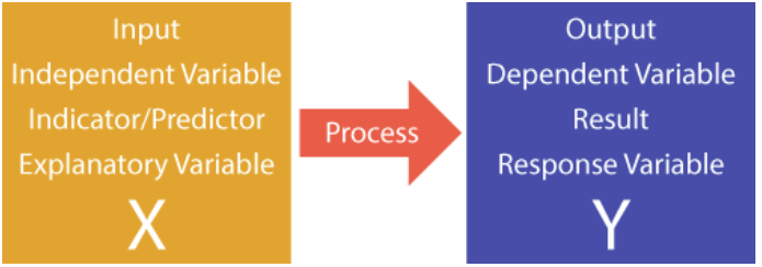
Results metrics are also called dependent or response variables, whereas inputs are called independent or explanatory variables.
5.10 Pareto Chart Toolset
The first step to solving any problem is to decide what to work on - prioritizing. Every organization has limited resources, so setting priorities correctly to align actions with intentions is a necessary foundation for success.
One of the simplest ways to establish priorities is to construct a Pareto chart showing relative values. The Pareto Chart shows the relative frequency of defects in rank-order, and thus provides a prioritization tool so that process improvement activities can be organized to “get the most bang for the buck”, or “pick the low-hanging fruit”.
Example: medication errors at hospital
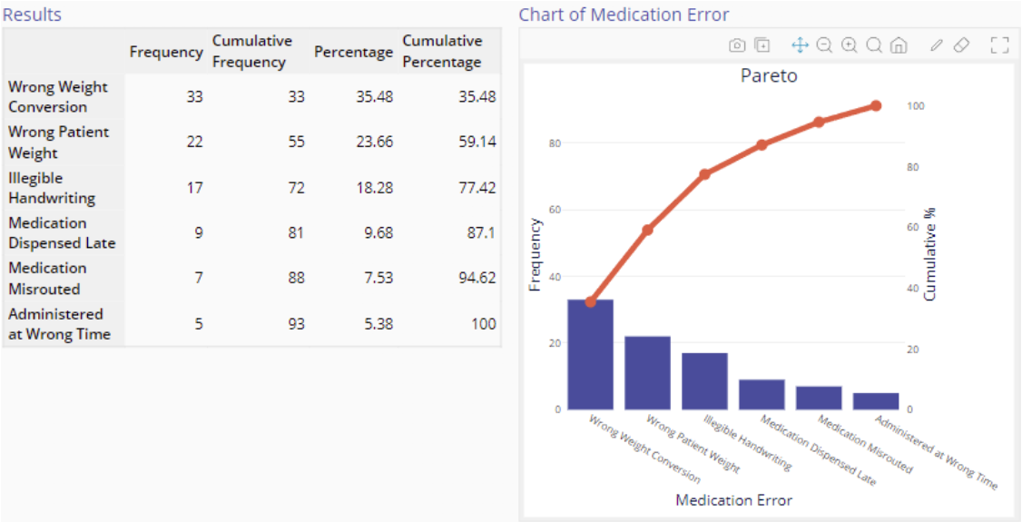
After reviewing the chart above, there is no question as to which errors should be tackled first, because patient weight-related problems occupy the top two positions
However, this Pareto chart is constructed using one dimension only - error frequency. If you learned that the severity of misrouted medications (medications switched between patients) is much greater, then misrouted medications would probably be the highest priority. A chart which takes into account the severity ratings in addition to the frequencies is called a weighted Pareto chart.
After identifying the highest-priority areas for corrective action, it may be useful to stratify the data - break them down further into a sub-Pareto. In the case of misrouted medications, it could be useful to stratify by shift, type of medication, or area of the hospital.
5.11 Histogram
Skewed histogram: right skewed means tail is in the right side 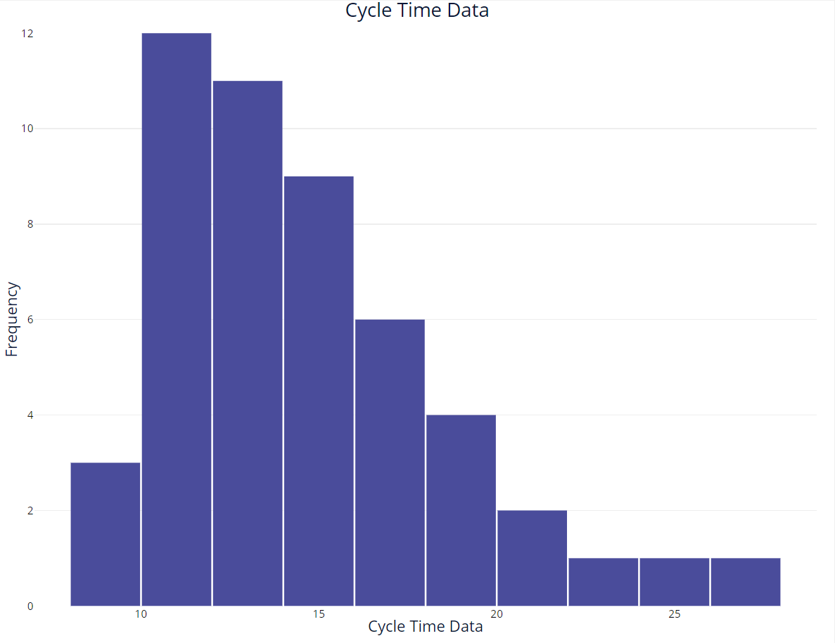
Central Tendency
Mean, Median, Mode
For a skewed distribution, the mean is not a good measure of central tendency. The median is a better measure of central tendency for a skewed distribution.
Process Variability
Range ([Min, Max]), Variance and std
5.15 Box Plots Toolset
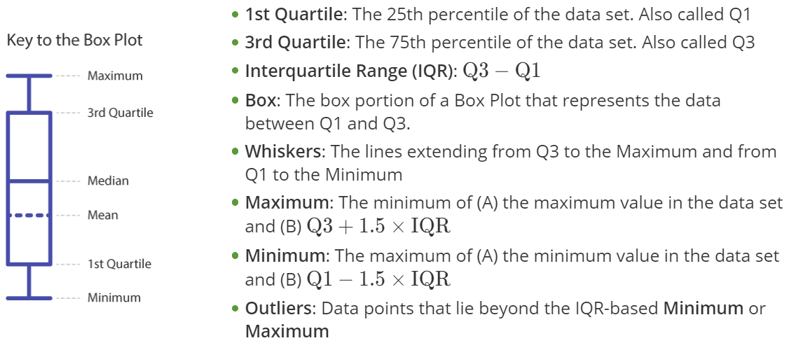
The Box Plot, which is also known as a Box and Whiskers Plot, is a graphical analysis tool used to investigate the effect of discrete inputs on continuous outputs
When to Use
Box Plots are a powerful graphical tool that can be used to explore potential Xs identified by the team, compare inputs (Xs) side-by-side to identify potential significant factors that require further statistical analysis, or graphically represent a process change that is the result of an improvement the team has made. The box plot is also useful when it is desired to summarize the variation, skewness and center of a large dataset, while also identifying potential outliers (能够处理异常值是箱型图的一个非常重要的价值)
The box plot can be used to answer the following questions:
- Is there a difference in the median between inputs (factors)?
- Is there a difference in the range (Q3 - Q1) between inputs? Are the data skewed?
- Is an input potentially significant?
5.16 Normal Distribution
The distribution of sample means from any distribution is well approximated by the normal distribution, due to the Central Limit Theorem (CLT), which states that as the sample size increases, the distribution of the sample mean tends toward the normal, irrespective of the shape of the original (parent) population. In addition, the distribution of the sample mean has a smaller spread, or variance, compared to the original distribution (due to the effects of averaging).
The Empirical Rule
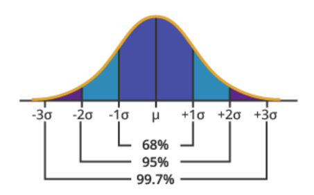
Also called the 68-95-99.7% rule, the empirical rule states: 68% of the values under the normal curve fall within one standard deviation of the mean, 95% within two standard deviations and 99.7% within three standard deviations of the mean.
5.17 Distribution Identification
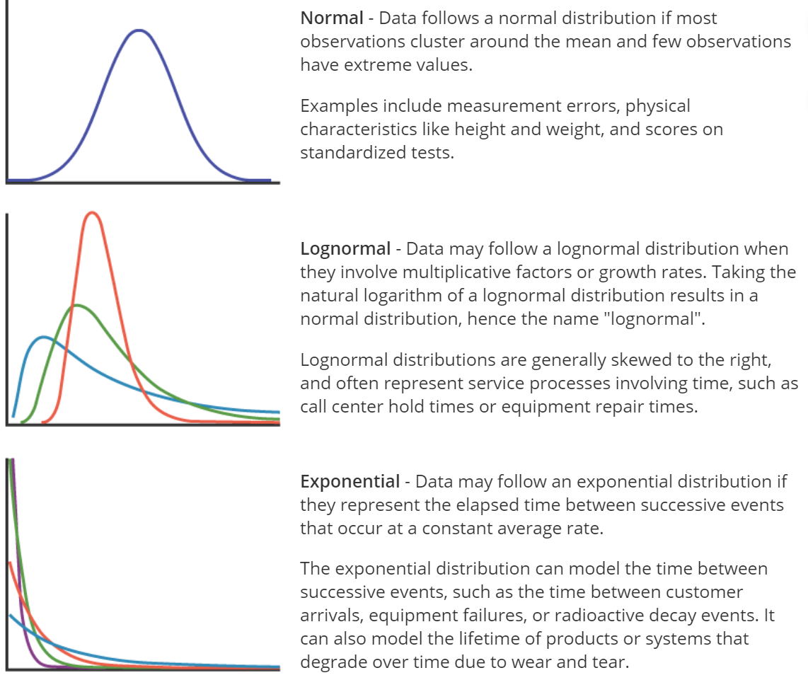
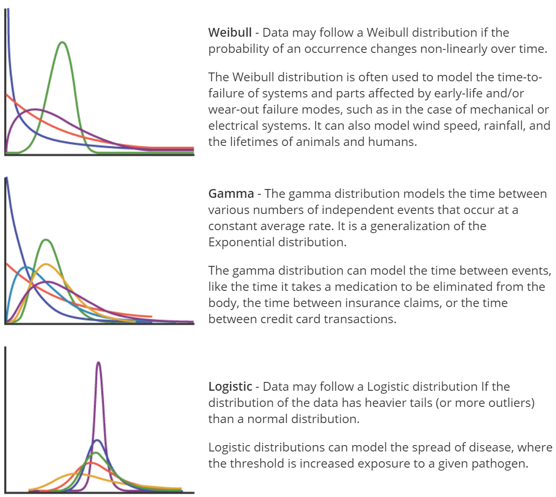
If you conduct an analysis that assumes the data follow a normal distribution when, in fact, the data are non-normal, your results may be inaccurate. To avoid this error, it is important to determine the distribution of your data before planning a course of analysis.
Here are some common distribution types:
p-value
For a given distribution (in this case, normal), the higher the Anderson-Darling test $p$-value, the better the fit, with the minimum $p$-value for “good fit” generally being 0.05.
Q-Q (Quantile-Quantile) plots
Points falling generally in a straight line along the diagonal indicate a good fit.
The normal distribution is not a good fit for the following data, because the $p$-value is less than 0.05, and the Q-Q plot is not really linear 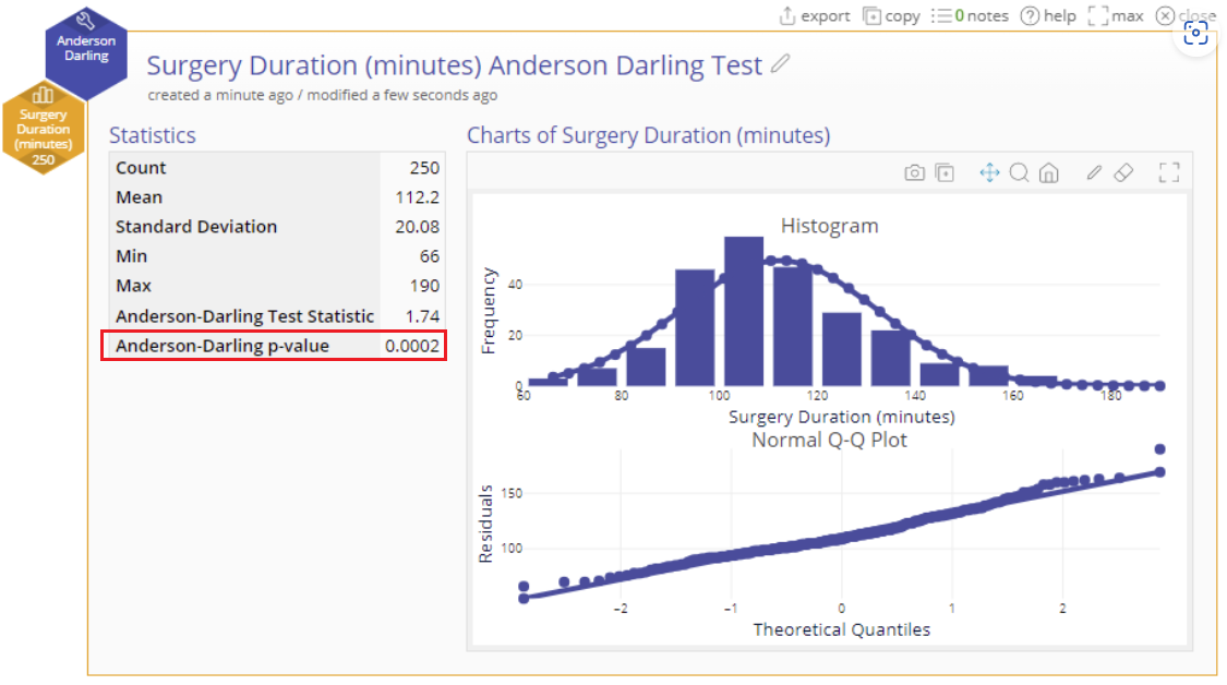
5.18 Data Cleansing
1. Start by Scanning the Data
Here’s a checklist for scanning your data:
- Is the dataset free of cells with missing data?
- Are data and variable names spelled, capitalized, and formatted correctly and consistently?
- Is the dataset free of any sums or aggregations of data? (For example: “Total Sales” at the bottom of a column of sales figures - including these in datasheets used for analysis can seriously skew results.)
- Is the dataset free of any obvious outliers or obviously incorrect data?
- Do the data appear valid and complete?
- Are you aware of the types of data variables you are working with? Note which data variables are continuous, categorical, or date/time. This will factor into the types of visualizations and analysis you engage in.
2. Next, Visualize the Data
Use appropriate graphs, like histograms, to show the distribution of the data to further investigate any underlying issues in the data.
- Create bar graphs of categorical data
- Simple bar graphs: do the levels of the categorical data have counts/frequencies as expected? Are all the level names spelled correctly?
- Clustered/stacked bar graphs with another variable: do the levels of one categorical variable appear as often as expected across levels of the other categorical variable?
- Create histograms for continuous data
- Does the distribution of the continuous data make sense?
- Is the distribution free from unexpected skews or patterns?
- Create run charts for time-ordered data
- Does the trend make sense / is it what you might expect?
6. Measure II - Measurement System Analysis
6.2 Measurement Process
The simplified flow chart below displays the typical steps in a measurement process:
- Identify what to measure This screening process can be based on experience later confirmed by experimentation. The Cause & Effect Matrix is a useful method to refine information from brainstorming and identify those process inputs which may have the greatest impact on the output of interest (Y).
- Determine how to measure the characteristic
- Establish operational definition.
- Identify data source.
- Develop and document data collection method.
- Train operators/technicians.
- Develop Sampling Plan and Reaction Plan
- Sampling Plan: When and where to collect data, what to do with the data.
- Reaction Plan for out-of-spec. or out-of-control conditions.
- Validate measurement system
- Measurement System Analysis (Gauge R&R) to quantify error. This includes analysis of stability, bias, linearity, repeatability & reproducibility.
- Adjust as required.
- Add to Overall Control Plan Verify Inclusion in Calibration Program and Add to Control Plan (Master Plan For All Measurement Activity).
6.3 Cause & Effect Matrix Toolset
The Cause and Effect Matrix is used to prioritize the process inputs (causes, or X’s) that have been identified as potentially contributing to an Effect (Y). This action usually leads to the selection of inputs for data collection and subsequent analysis.
Advantages of the Cause and Effect Matrix:
- The C & E Matrix provides a way to prioritize potential causes based on the number of CTQC’s affected and the strength of the relationship between potential causes (X’s) and effects (Y’s).
- It appeals to team members who are more comfortable with ranking techniques than visual tools.
- The matrix also brings together the CTQC’s from the Tree Diagram and the process steps identified during process mapping. This promotes “process thinking” and provides a logical linkage between the tools.
Example
A team at a Medical Center is working on reducing the patient accounts receivable that must be turned over to a collections agency. Using a CTQC Tree Diagram, the team has identified 10 CTQC’s that, if satisfied, would result in more timely payments and reduced collection agency placements. They placed the Y’s along the left side of the matrix. The process steps (X) that could contribute to the problem are placed along the top of the matrix.
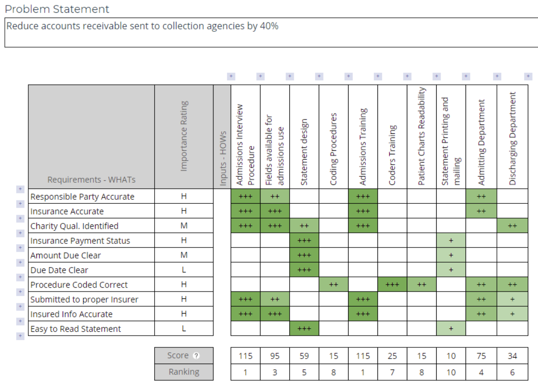
The team should do a “reality check” at this point and make sure the results make sense
How
- Step 1: Place the CTQC’s (from a Tree Diagram) along the left side of the cause and effect matrix. These are the Effects.
- Step 2: Rank the importance of each of the Effects, or CTQC’s, from the customer’s point of view.
- Step 3: Place the Process Inputs (X’s) along the top of the matrix. These are the Causes, and they will have been identified through process mapping and brainstorming, possibly with help from a Fishbone Diagram.
- Step 4: Assign a correlation factor between the Causes and the Effects based on experience and process knowledge.
- Step 5: Evaluate the output and check for consistency.
- Step 6: Choose which factors you wish to analyze further. (Note: Overall Input Importance Score is the product of the Importance Ranking x the Correlation Factor).
6.4 Measurement Systems Analysis
If measurements are used to guide decisions, then it follows logically that the more error there is in the measurements, the more error there will be in the decisions based on those measurements. The purpose of Measurement System Analysis is to qualify a measurement system for use by quantifying its accuracy, precision, and stability.
Measurement System Analysis is a critical first step that should precede any data-based decision making, including Statistical Process Control, Correlation and Regression Analysis, and Design of Experiments.
A measurement system can be characterized, or described, in five ways: Location (Average Measurement Value vs. Actual Value):
- Stability refers to the capacity of a measurement system to produce the same values over time when measuring the same sample. As with statistical process control charts, stability means the absence of “Special Cause Variation”, leaving only “Common Cause Variation” (random variation).
- Bias, also referred to as Accuracy (see diagram below), is a measure of the distance between the average value of the measurements and the “True” or “Actual” value of the sample or part. See the illustration below for further explanation.
- Linearity is a measure of the consistency of Bias over the range of the measurement device. For example, if a bathroom scale is under by 1.0 pound when measuring a 150 pound person, but is off by 5.0 pounds when measuring a 200 pound person, then the scale Bias is not constant and it will be important to understand if this Bias changes in a linear fashion or not. Linearity may be expressed as an index, or as a percentage of the process variation.
Variation (Spread of Measurement Values - Precision):
- Repeatability assesses whether the same appraiser can measure the same part/sample multiple times with the same measurement device and get the same value.
- Reproducibility assesses whether different appraisers can measure the same part/sample with the same measurement device and get the same value.
The diagram below illustrates the difference between the terms “Accuracy” and “Precision”:

Measurement System Requirements
Following are general requirements of all capable measurement systems:
- Statistical stability over time.
- Variability small compared to the process variability.
- Variability small compared to the specification limits (tolerance).
- The resolution, or discrimination, of the measurement device must be small relative to the smaller of either the specification tolerance or the process spread (variation). As a rule of thumb, the measurement system should have resolution of at least 1/10th the smaller of either the specification tolerance or the process spread. If the resolution is not fine enough, process variability will not be recognized by the measurement system, thus blunting its effectiveness.
Methods
We will present both the Gauge R & R and graphical methods, and we suggest that they be used together.

- Stability is the total variation in measurements obtained using the same measurement instrument, measuring the same characteristic, on the same master part, over an extended period of time.
- Bias is the difference between the observed average of measurements and the reference value.
- Linearity is a measure of the consistency of Bias throughout the expected operating range of the gauge. The purpose of determining the linearity of a measuring instrument is to understand whether the bias (systematic error) in the instrument has a linear relationship with the reference values.
6.6 Variable MSA - Gauge R & R
After taking steps to ensure that the measurement system is: 1) stable, 2) injects a minimum of bias into the results and 3) that any bias present is consistent over the expected range of the gauge (linearity), the next step is to assess acceptability of the measurement system by conducting a Gauge R & R study. Gauge R & R stands for Gauge Repeatability and Reproducibility - an assessment that compares the variation in measurement from three components:
- APPRAISERS (评估师) - the variation that exists between two or more appraisers due to differences in experience, training, ability, etc. This type of variation, also called reproducibility, is not desirable and is characterized as a component of measurement error.
- GAUGE (also spelled “gage”) - the variation in repeated measurements of a given dimension of the same part or unit by the same appraiser, using the same measuring device. This type of variation, also called repeatability, is often the result of poor gauge design or poor calibration practices. This type of variation is also characterized as a component of measurement error.
- PARTS or UNITS - the variation in any given dimension of units or parts produced from the same process. This variation is a natural part of any process. As long as the process is stable and in control, this type of variation is expected and acceptable.
How to Perform a Gauge R & R Study
Step 1 - Satisfy the Prerequisites
It is critical to assess the stability, linearity and bias of the measurement device (gauge) and make any necessary corrections before proceeding with the Gauge R & R Study
Step 2 - Prepare
Determine how many units or parts will be measured. Typically at least 10 parts are selected for the study. Next, decide how many times each part will be measured. This is called the number of Trials. You should have at least 2, or preferably 3 trials to measure repeatability. Finally, decide how many appraisers will be measuring the parts. You should select at least 3 appraisers to measure the parts, unless there are fewer than 3 appraisers who use the measuring device. The appraisers should be chosen from among those who operate the gauge or measuring device on a day-to-day basis.
Step 3 - Collect the Samples
When collecting samples, you should ensure the sampled parts represent the total possible variation that exists in the process (collect samples from the entire production process)
Step 4 - Measure the Samples
The gauge must have a measurement discrimination that is 1/10th or a smaller fraction of either the expected process variation or the specified tolerance, whichever is smaller. In other words, if the expected process variation is 0.01, the gauge should be able to detect a change of 0.001 or an even smaller increment.
Step 5 - Analyze the Data
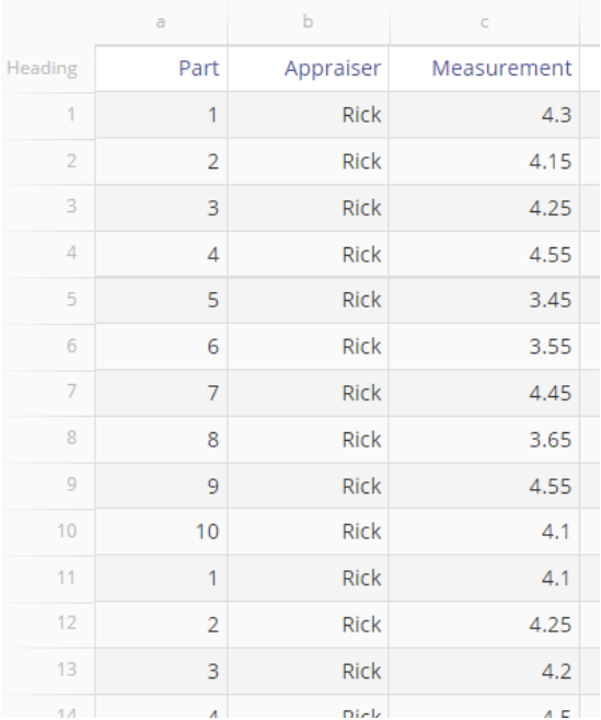
Step 6 - ANOVA Results
(6.1) Analysis of Variance (ANOVA) table
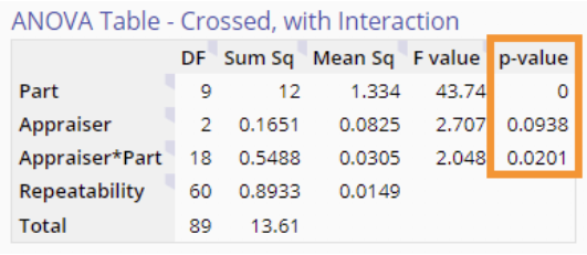
Rows:
- Parts: the variation that exists across the sampled parts. This variation is fine and expected. 10 个 parts 中以其中的一个为 reference,因此 DF = 9
- Appraiser or Operator: the variation that exists across the appraisers (or operators) in your study. 3 个 appraisers 中以其中的一个为 reference,因此 DF = 2
- Appraiser*Part: this interaction term represents the variation that exists between operators and parts (it highlights, for example, if one appraiser is consistently measuring some parts differently than others). 2*9 = 18
- Repeatability: all the variation that cannot be assigned to the parts, operator and operator*part interaction. Repeatability variation is attributed to the gauge. 以第一个人做的 3*10 = 30 次为标准,另外两个人需要做同样的 30 次并一一于第一个人做的比较,因此 30 + 30 = 60
Columns:
- DF: degree of freedom
- Sum Sq: sum of squares
- Mean Sq:= Sum Sq / DF
- F-Value:
- Part F-Value = Part Mean Sq / Appraiser*Part Mean Sq (这个 Sq 位于第三行第三列)
- Appraiser F-Value = Appraiser Mean Sq / Appraiser*Part Mean Sq
- Appraiser*Part F-Value = Appraiser*Part Sq / Repeatability Mean Sq
- p-value: A p-value < 0.05 (our chosen significance level) indicates that the corresponding source of variation is statistically significant. In this example the Part and Appraiser*Part interaction effects are significant
(6.2) Variance Components
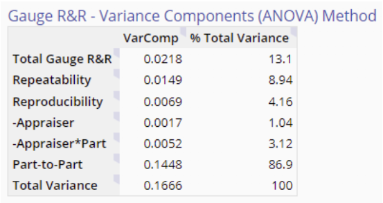
- Total Gauge R&R:= Repeatability + Reproducibility (the total variation in the measurement system)
- Repeatability (also called Equipment Variation, or EV) - the variability seen when the same operator measures the same part more than once using the same measuring device.
- Reproducibility (also called Appraiser Variation, or AV) - the variability seen when the same part is measured by different appraisers using the same measuring device.
- = Var Appraiser + Var Appraiser*Part
- Part-to-Part Variation (also called Part Variation, or PV) - the variability seen when the same part is measured by the same appraiser using the same measuring device.
For this table, focus on the ‘% Total Variance’ column. The Part-to-Part component accounts for 87% of the total variation while the Total Gauge R & R contributes the remaining 13% (which is greater than our 9% cut-off). This is not an acceptable result; when the variation due to the measurement system makes up a large component of the total, you cannot be confident that the system is able to distinguish between parts. Repeatability is contributing most of this variation (8.9%), but there is also a significant appraiser by part interaction (shown in the ANOVA table above), pointing to some problems with the way that appraisers are measuring the parts.
Step 7 - Characterize the Gauge

Gauge R & R Graphical Evaluation
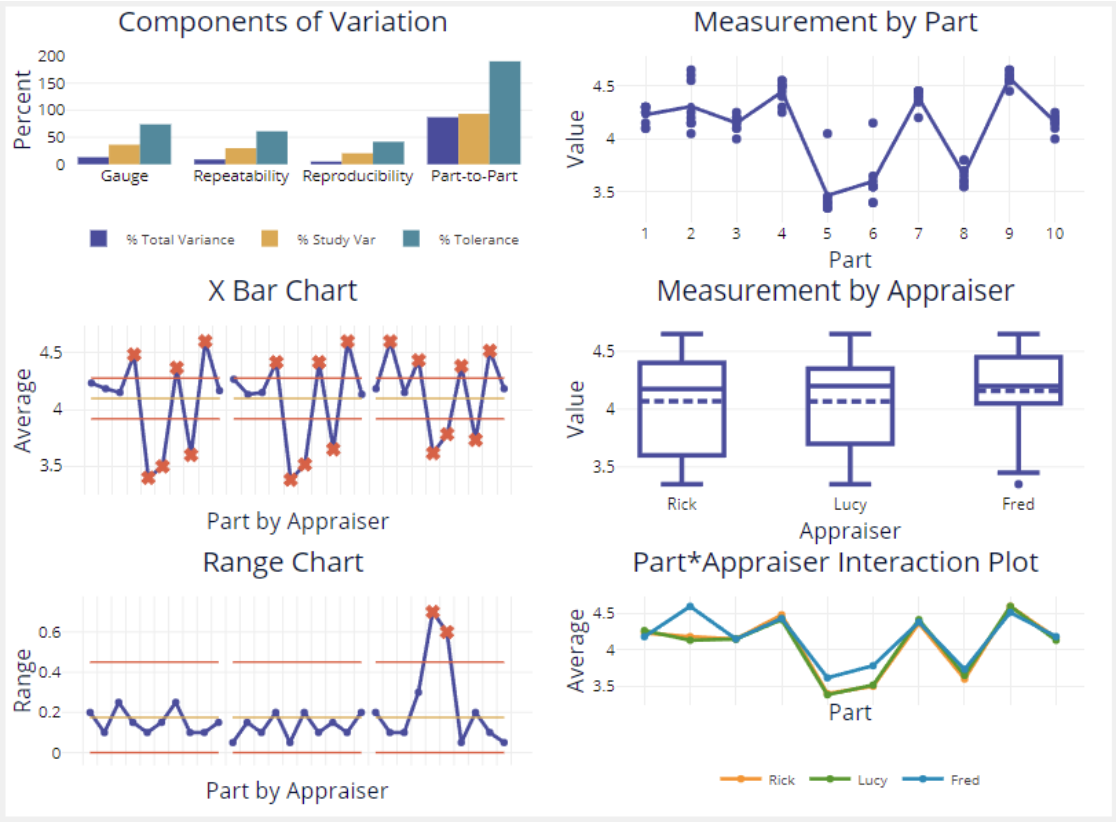
- Measurement by Part graph shows the average part measurements are fairly spread apart, so the differences among parts is clear.
6.7 Attribute Measurement System Analysis
An attribute measurement system categorizes one or more characteristics based upon comparison to a specific set of limits or criteria, as defined by the Operational Definition. As with measurement systems using variable data, attribute measurement systems should also be qualified before they are used to make decisions by applying a Repeatability and Reproducibility (R & R) evaluation.
One common type of attribute system is a Go/No-Go gauge that either accepts or rejects a part. Unlike variable measurement systems, an attribute gauge does not provide any information about HOW good or HOW bad a part is. A part marginally within the specification limit is judged equal to a part that is exactly at the target value.
Another type of attribute measurement system is a Rating Scale, where three or more categories are established by the Operational Definition, such as movie ratings, grades of lumber, or a credit scoring process.
The method of attribute measurement system analysis shown in this toolset is called the short method by industry practitioners. In the next section we present an example of attribute measurement system analysis used on data from the hotel industry.
How To Evaluate An Attribute Measurement System
Using at least 20 trials and two appraisers. Appraisers should evaluate an output using an binary (T/F), ordinal, or “ranked” scale.
To determine how the study will be conducted, the criteria for what constitutes an acceptable gauge or measurement system should be laid down in advance, as well as the required confidence level of the analysis (such as a target of 95% agreement)
After selecting the units and criteria, the appraisers assess all units in random order, repeating the process for each new trial. This process must be randomized to prevent appraiser bias. In the case of ordinal data, all rating categories should be represented in the study.
Next, the results from the appraiser assessments are recorded in a table so that all results can be compared. If the repeatability and reproducibility is high, then the measurement system is acceptable. If not, then the measurement system must be improved - usually by clarifying the Operational Definition or providing better training to appraisers to reduce variation in application of the standard.
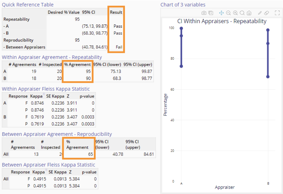
In the example above, the 65% Agreement in reproducibility falls short of the 95% goal. This indicates a significant inconsistency between appraisers, undermining the joint reliability of their assessments. Evidently, the two appraisers are following different standards, or different interpretations of the standard, in their assessments.
6.8 Calibration of Measurement Systems
Calibration is the process of checking the measurement output of an instrument using a known standard, and adjusting the instrument as required to read-out the proper value. For example, putting a known standard weight of 10 lbs. on a scale and adjusting the scale to read 10 lbs. is an example of calibration.
6.9 Data Collection
Data collection errors can be introduced by any one of several factors:
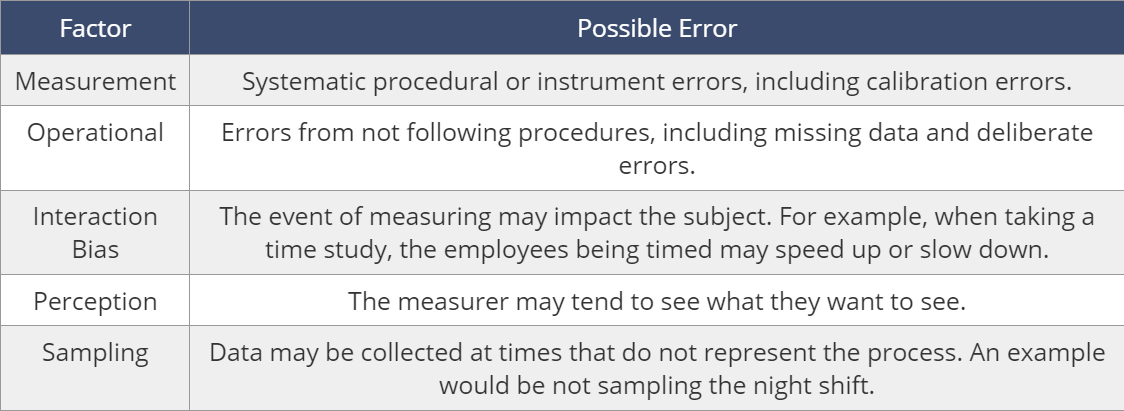
As you may have noticed, many of the error sources listed above are human in origin. The best way to eliminate those errors is to eliminate their potential entirely by automating the data collection process
Nevertheless, many situations will require manual data collection, either for a short term study, or a long term application that can’t be automated. In those situations, a Check Sheet should be constructed for recording data. The check sheet can be constructed in many ways to fit the task at hand, but should satisfy five requirements:
- Show what is being measured.
- Show who is collecting the data.
- Show what time period is associated with the data.
- Clearly marked space to record the data.
- Stratification of the data into useful categories (raw totals don’t - usually render useful information for problem-solving)
Data Sampling Plan
Completely random sampling is difficult to execute in a production environment. What is practical is to specify a plan based on random sampling, where the entire range of output is reasonably represented.
Types of Random Sampling
- Simple random sampling: This is a method of selecting n units from a population such that every possible sample of size $n$ has an equal chance of being drawn.
- Stratified random sampling (分层随机抽样): If the population consists of naturally different segments (strata) such as different machines, groups, shifts, product variations, etc., consider using a stratified sampling plan. For example, a pizza delivery chain might want to collect data on average delivery time and stratify the sampling to look at different times (weekdays vs. weekends, hour by hour in the evening) or different geography (different neighborhoods served). In this case, units would be randomly sampled from within each stratum to form the sample, and all units in a stratum would have an equal chance of being selected. Be sure to associate the data with the stratum it came from so you can connect the dots to possible root causes when you see a pattern.
- Systematic random sampling: Involves selecting one unit randomly and choosing consecutive units at evenly spaced intervals until the desired number of units is obtained. This plan could be useful when selecting manufactured units moving along a production line. (例如每隔 20 个客人就发一张满意度调查表)
- Cluster or multi-stage random sampling: Used when a list of the population units themselves is not available, but a list of clusters of units such as households, cities, departments, etc. is. In this case, a sample of clusters is selected randomly, and all units belonging to the selected clusters are included in the sample. If units from each cluster are further selected by random sampling, this becomes a two (multi) stage sampling plan.
6.11 Baseline Performance
Effective process improvement initiatives depend on utilizing “before” data to assess the impact of any implemented changes. This “before” data is also known as baseline data. In this lesson, we will cover two methods for measuring defects to develop insight into your process and lay the groundwork for further process capability analysis and improvements.
At this point in the improvement process, you should know:
- What you want to accomplish (Project Charter)
- What to measure (CTQCs with Operational Definitions)
- Whether the measurement system is valid (Measurement System Analysis)
The next step is to use your measurement system to establish baseline data that is representative of your current process. Starting from that baseline, you can measure the difference between current and desired performance, and then formulate strategies to bridge that gap. By collecting and analyzing defect data throughout your process, you can get a clearer picture of its current state and potential for improvement. Key metrics include:
- Yield (良率): The proportion of products that meet quality standards.
- DPMO (Defects Per Million Opportunities): Quantifies the number of defects in a process for every one million opportunities.
- Sigma Level: Indicates process capability in terms of standard deviations. Higher sigma levels indicate lower defect rates.
How to Measure Defects
To establish a baseline for performance, begin by measuring defects in the final output. As your initial defect data is collected, shift your focus “upstream” to earlier stages of the process. This allows you to identify and quantify defects at each step, providing insights into the root causes of issues rather than merely their symptoms. By continually measuring defects and refining the process based on these metrics, you create a system that becomes increasingly stable and predictable. Over time, as the process matures and defect metrics stabilize, you can shift your focus from constantly measuring defects in the output to closely monitoring the quality of process inputs. In doing so, you ensure that a well-tuned process consistently produces high-quality output. To work toward this, defect metrics can be counted in two ways:
- Defective units (called “defectives”): Every unit with one or more defects is counted as a single entity, irrespective of the number of defects present on it.
- Defects Per Unit (DPU): Counts the individual defects on each unit, highlighting the multiple opportunities for defects that can occur on a single item.
Defects per unit (DPU) tends to offer a more comprehensive view of product quality. Instead of solely focusing on defects identified at the end of the process or upon service consumption, DPU emphasizes capturing defect data at every stage of production. This depth can reveal significant inefficiencies; rework, for instance, can sometimes contribute to 10-20% (or even more) of the total cost and cycle time. It might be necessary to undertake a study to uncover the hidden waste in the process, reinforcing the importance of more granular in-process data collection.
Throughput Yield
Throughput Yield (YTP) is a measurement taken at a single process step based on
\[\text{YTP} = \frac{\text{Number of defect-free units}}{\text{Total number of units}}\]Calculating Throughput Yield relies on counting defective units. However, this approach can overlook the fact that some units may contain multiple defects, some of which may be more serious than others. The more direct metric of Defects Per Unit (DPU) evaluates the number and nature of defects at each individual step. The DPU method is straightforward, demands no intricate mathematical adjustments, and directly reflects the primary concern of improvement efforts: the defects themselves.
Rolled Throughput Yield
Rolled Throughput Yield takes the previously discussed throughput yield and expands it into a process-wide metric to express the probability that a given unit will make it through the whole system without a defect.

Sigma Level
When calculating the Sigma performance level for a product or process, the metric Defects Per Million Opportunities (DPMO) is generally used
Yield, DPMO, and Sigma Level 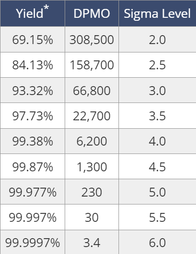
For example: 35 possible defects that could occur during each loan approval and documentation process. Company records indicate that 2,500 loans were processed during the last year, and out of those 2,500 loans, 3,500 defects were identified.
$\text{DPMO} = 3500/(35*2500) * (10^6) = 40,000$
So based on the table above, Sigma Level is between 3.0 and 3.5.
When to Use? The Sigma Level metric is calculated early in a Lean Six Sigma project. The Sigma Level provides a high level baseline metric to understand the capability of a process (or entire organization) to meet customer requirements. It can be used to answer the following questions:
- How does the overall organization compare to other organizations?
- How does a specific process compare to other processes, even if they have different levels of complexity?
- What is the baseline performance of an organization or specific process prior to improvement actions?
- Did the improvement actions have an impact on performance?
7. Measure III - Charting Process Behavior
Information does not automatically become knowledge. Measuring and collecting information is necessary, but not sufficient without supplying the proper context. With most process data, that context is time.
In this session, you will learn effective methods to evaluate process behavior over time.


2. Key Concepts in Six Sigma
2.1 Critical to Quality Metrics
(1) VOC (Voice of the Customer): needs and expectations expressed in the customer’s language
(2) CTQs (Critial-to-Quality Requirements): the performance characteristics of a process, product, or service critically important to customers
It’s important to translate VOC to CTQs
For example, for a pizza store: |VOC|CTQs|Metrics|CTQs Target| |-|-|-|-| |”Don’t want to wait too long”|On-time delivery|Order to delivery (mins)|<= 30 mins| |”Don’t want cold pizza”|Hot pizza when delivered|Pizza temperature (degrees)|>= 32 degrees|
Six Sigma Basic Premise: \(Y=f(X)\)
- $Y_1=$ delivery time
- $Y_2=$ pizza temperature
- $X=$ factors affecting $Y_1,Y_2$
2.2 Defect Opportunities
(1) For a marker, there might be 5 defect opportunities such as leak, ink color, cap…
(2) For a PC, there might be 1000 defect opportunies
Let’s assume either marker or PC have 2 defects per unit, then
DPO (defects per opportunity)
- Marker: 2/5 = 0.4 DPO
- PC: 2/1000 = 0.002 DPO
DPMO (defects per million opportunities)
- Marker: 0.4 DPO * 1,000,000 = 400,000 DPMO
- PC: 0.002 DPO * 1,000,000 = 2,00 DPMO
2.3 Sigma Level
A performance metric used to indicate the quality level of a product, process, or service
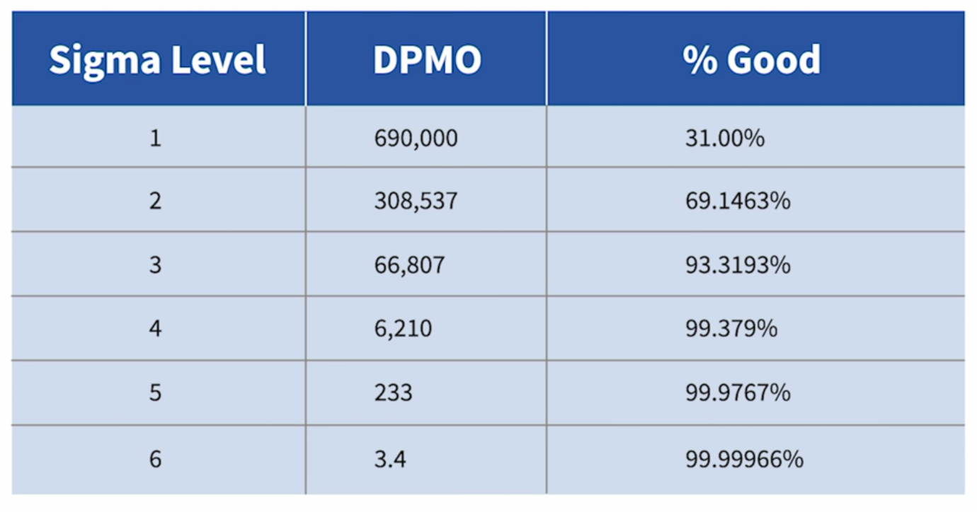
2. DMAIC: A Six Sigma Methodology
DMAIC: Define, Measure, Analyze, Improve, Control
2.1 Define
(1) Develop problem and goal statements
Problem Statement
- Requirements: Reccuring, Specific, and Measurable
- Example: the problem stated below is a chronic, reccuring problem, stated in specific and measurable terms
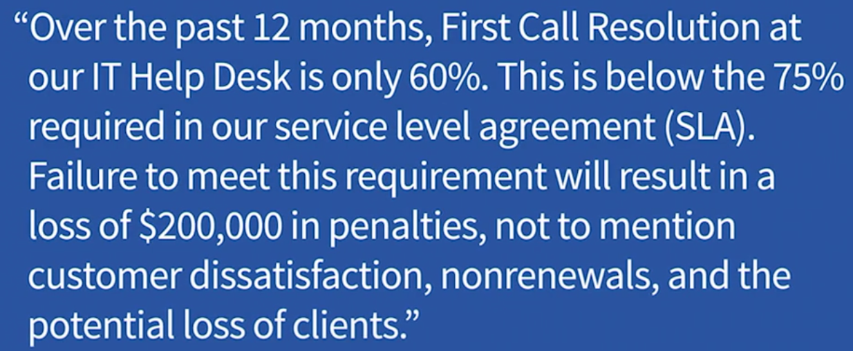
Goal Statement
- Ask ourselves: What measurable perforance outcome must the project accomplish? By when?
- Be SMART:
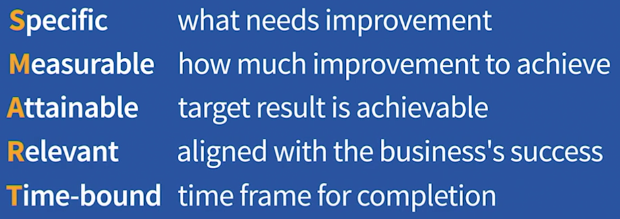
- Example:

We need to define what is the $Y$, the performance measure to improve, in the equation of $Y=f(x)$
(2) Develop project charter
A document providing direction and focus to the team:
- Project name
- Problem and goal statements (based on step one above)
- Key Metric $Y=f(x)$
- Expected benefits (operational and finantial)
- Project scope (project boundary)
- Milestones (check point datas)
- Signatures
- Project leader: agrees to take on project
- Finance: validates expected financial benefits
- Champion: approves launch of the project
(3) Develop a SIPOC diagram
Purpose is to document and communicate overall scope of processes related to the project on one page
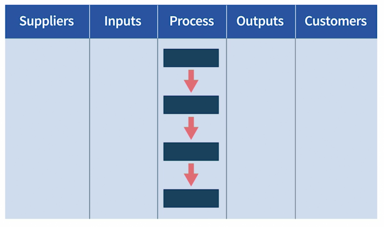
2.2 Measure
Steps:
- Develop data collection plan
- Map relevant processes
- Validate measurement system
- Measure the $Y$ in $Y=f(X)$
(1) Data collection plan:
- List specific questions regarding $Y$
- Tools needed
- Sources of data
- Type (continuous/discrete) and quantity of data required
Continuous data graphs: 
Discrete data graphs: 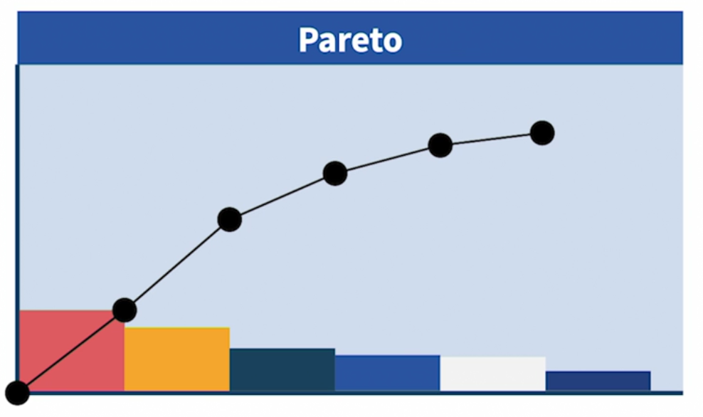
(2) Process Map:
A visual representation of the steps that take place in a process, from start to finish. Ex: Wake-up-and-get-to-work Process 
(3) Validate Data: use Measurement system analysis (MSA)
Requirements of a valid measurement: (using an example of weight scale 体重秤)
- Accurate with no bias: the scale should be calibrated
- Repeatable: if I weigh myself twice in a short time, the results should be same
- Reproducible: my weight in my home should be the same as my weight in my doctor’s office
2.3 Analyze
Purpose: Determine which $X$(s) impact $Y$ in $Y=f(X)$
Steps:
- List potential $X$(s) that impact $Y$
- Organize potential $X$(s)
- Shortlist and select key $X$(s)
- Develop data collection plan for the analysis
- Prove the key $X$(s) in $Y=f(X)$
(1) List potential $X$(s) that impact $Y$: brainstorm
(2) Organize potential $X$(s): use Cause-effect diagram (fishbone)
Ex: CE Diagram for Pizza Crust Problem (饼皮太硬)
- Fishbone:
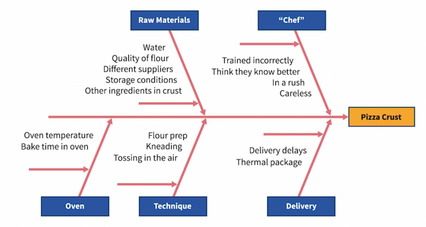
- Treemap (use Excel):
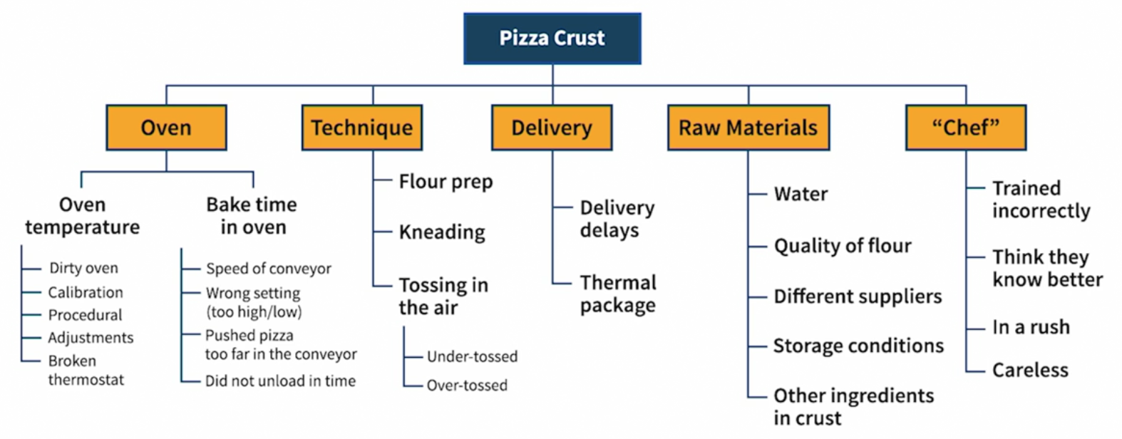
(3) Shortlist and select key $X$(s): based on the upper diagram
(4) Develop data collection plan for the analysis
- Which hypotheses to test
- What data to collect
- How much data we need
- Collect from whom, when, where
(5) Prove the key $X$(s) in $Y=f(X)$: Validation Process
- Inferential statistics
- Hypothesis test
Ex: Analyze and validate throught graphs and charts, using Pizza Crust Problem (饼皮太硬问题). To validate two potential $X$
- $X_1$: one or two resteraunt at fault
- $X_2$: Variation in oven temperatures
$X_1$ is proved using Pareto Chart for Crust Complaints by Store Location
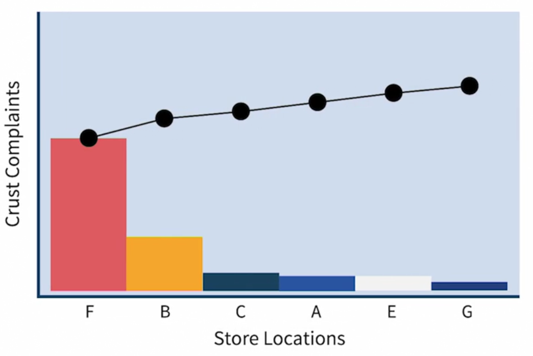
$X_2$ is proved using Dotplot and Boxplot for Temp Variation by Chef

2.4 Improve
Purpose: Address proven key $X$(s) and find solutions (best combination of key $X$(s)) to improve $Y$
Steps:
- Potential solutions for proven key $X$(s)
- Solution alternatives
- Right set of solutions to implement
Generate, evaluate, and select solutions
Evaluate solutions:
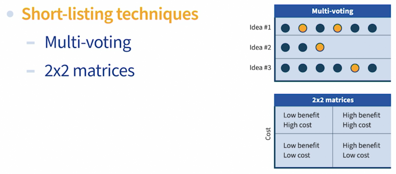
Select solutions: Pugh Matrix (Criteria selection matrix)
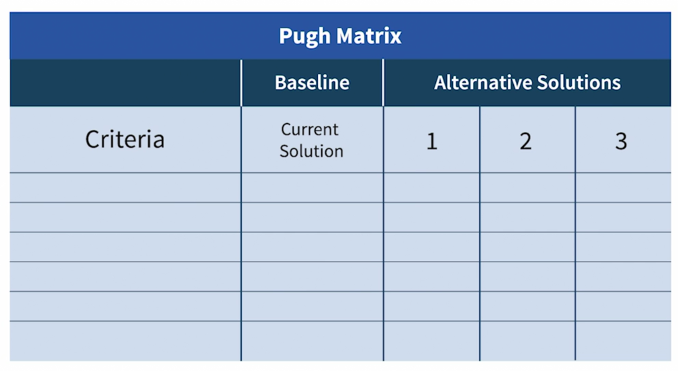
Reduce the risk of failure through FMEA
FMEA (Failure Modes and Effect Analysis) is a tool to help anticipate and mitigate risk of failure.
Order failure modes by Risk Priority Number (RPN):
\[RPN=\text{Severity}\times\text{Occurrence}\times\text{Detection}\]- $\text{Severity}$: What’s the effect? How severe is it (1-10)?
- $\text{Occurrence}$: What are potential causes? How likely is the occurrence of potential causes (1-10)?
- $\text{Detection}$: What process controls are in place to detect cause or failure mode? What’s the likelihood of detection (1-10)?
Mistake proofing (防范错误)
Adding mistake proofing to projects will be helpful. Three levels of mistake proofing:
- Prevention
- Ex: Change the operation sequence of ATM to prevent forgeting to remove card after taking cash
- Swap steps 4 and 6, that is, can only take cash after removing card
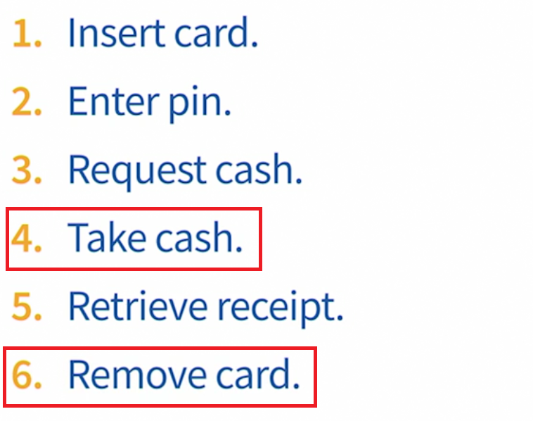
- Facilitation: if prevention is not applicable
- Ex: To avoid the cashier typing an inccorect price, try to scan Bar Code instead
- Detection:
- Ex: Spelling error detection in Word
2.4 Control phase:
Purpose: Control of key $X$ factors to ensure improved $Y$ is sustainable
Steps:
- Develop plan (Monitor, control, regulate performance)
- Work with owners to update procedures
- Implement and monitor performance
- Validate financial impact
- Secure project completion sign-off
Control Plan
Control plan is the blueprint to ensure the right controls are implemented to achieve sustainable targets:
- Control subject: what needs to be controlled
- Ex: oven temperature
- Specification, target, or desired range
- Ex: target 22C, hot more than 24C, cold less than 19C
- How feedback is provided
- When and what action to take
- Ex: when temp above 25, turn off AC; when below 15, turn off AC, or turn on heat if needed
- Who is authorized to monitor and take action?


Document Information
- Author: Zeka Lee
- Link: https://zhekaili.github.io/0007/09/01/Six-Sigma-Intro/
- Copyright: 自由转载-非商用-非衍生-保持署名(创意共享3.0许可证)
